
The pandemic opened up an unexplored territory for many businesses; it made us realize how technology was not only becoming a barrier to in-person relationships, but it was also not truly helping us connect with each other. It was a demanding presence to focus on all the details that had been slightly examined or overlooked, such as accessibility.
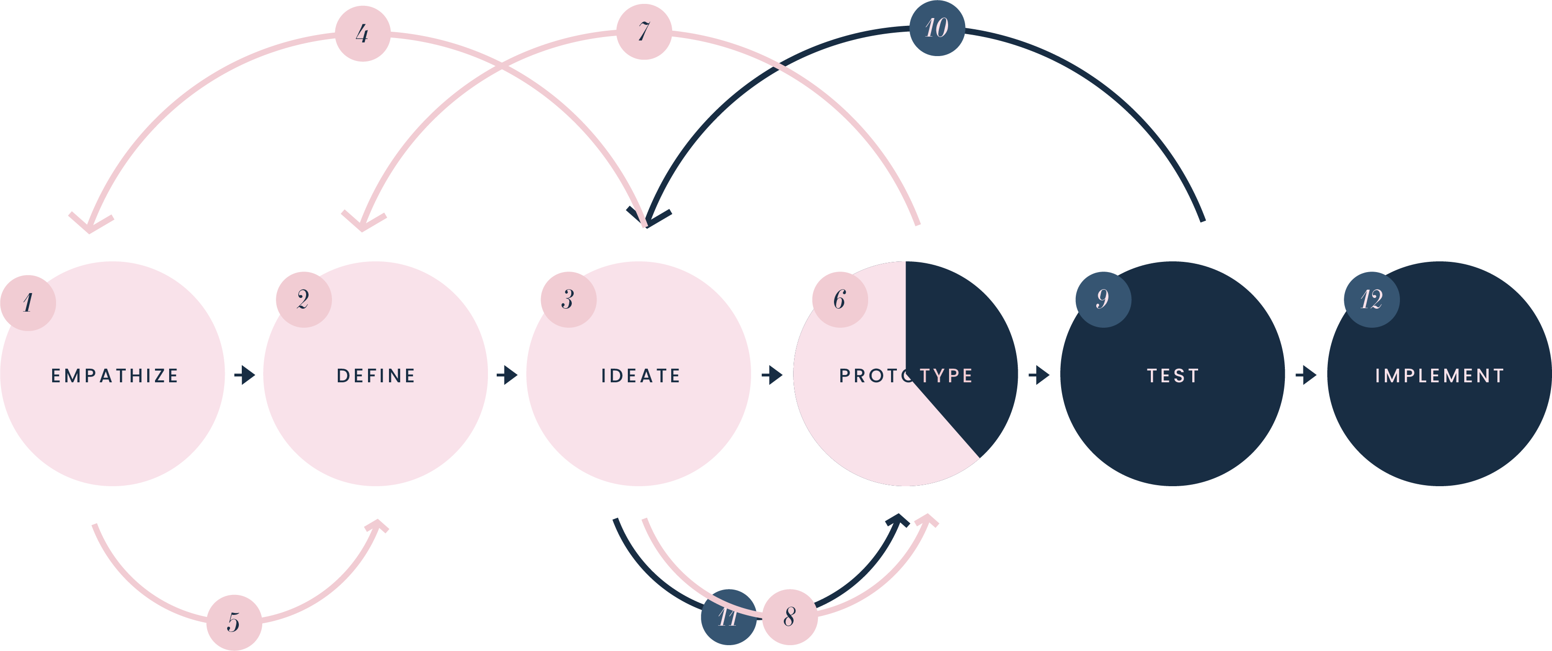
*As this project is still in progress, everything in pink are the completed tasks, and everything in navy blue are tasks yet to be completed.
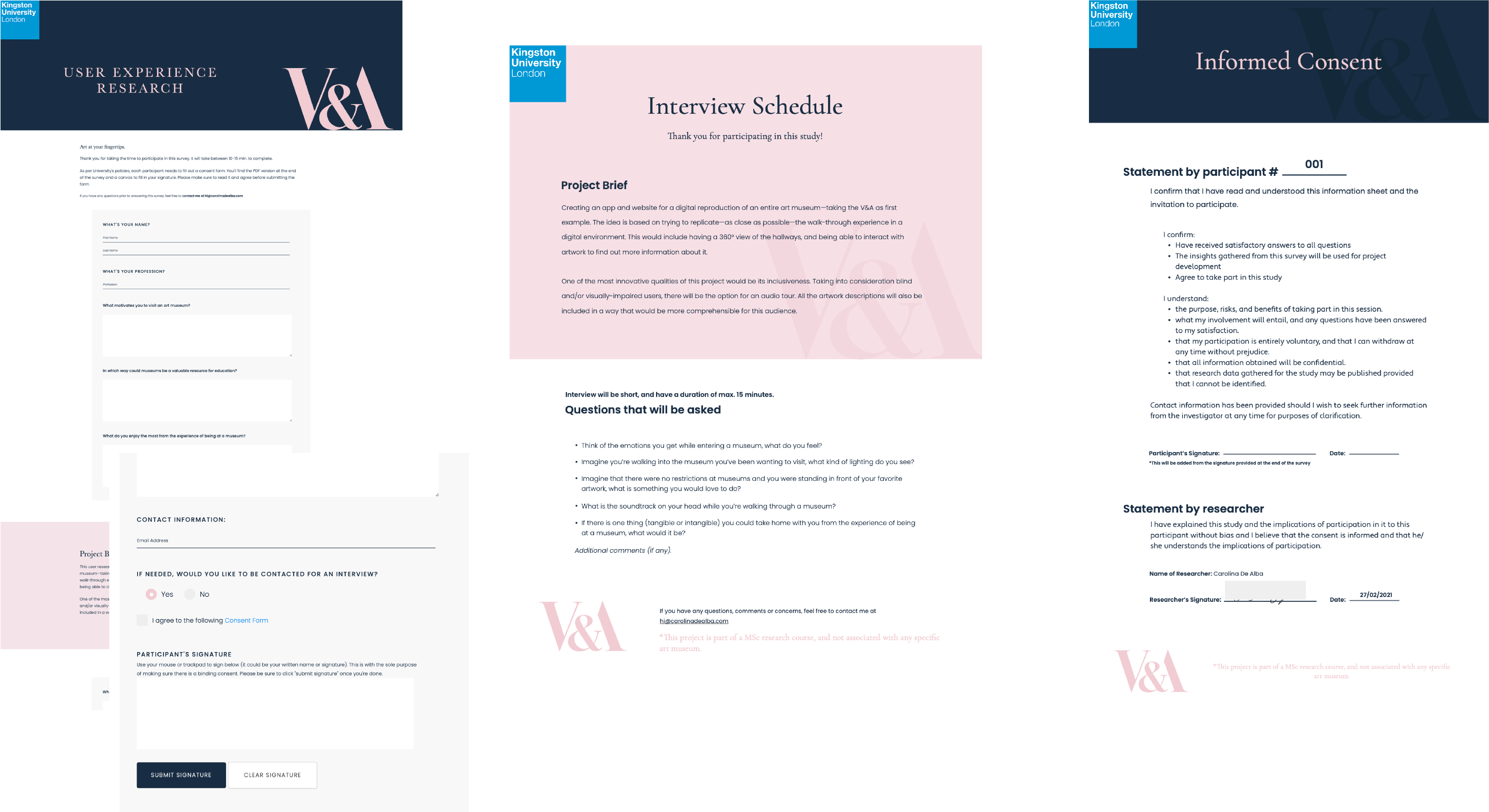
The forms above were created to send to participants. The first photo on the left shows the survey created on a website, in which participants could download the consent form and digitally sign it so they would not have to be personally contacted. The form in the middle shows the interview schedule sent to participants who agreed to be interviewed. Lastly, the form on the right shows the consent form for the survey.
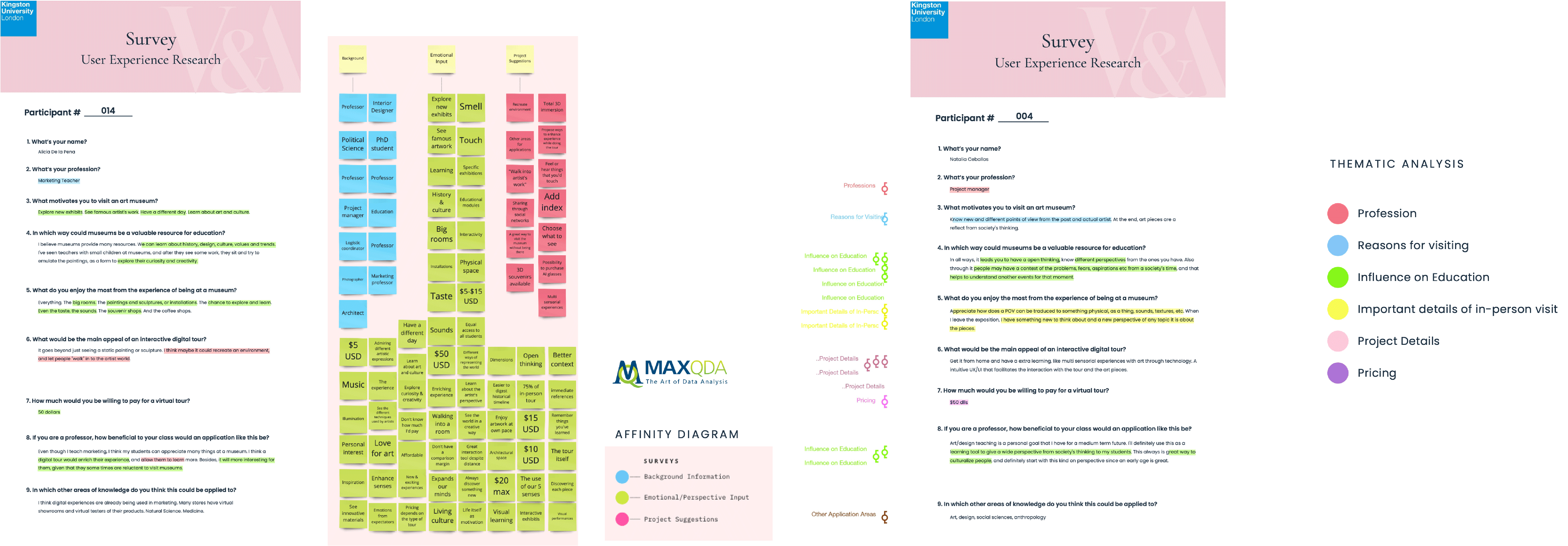
The MAXQDA software was utilized to analyze the information gathered from the participants. After creating an affinity diagram, consistent themes were identified that later led to a more specific thematic analysis of the data.
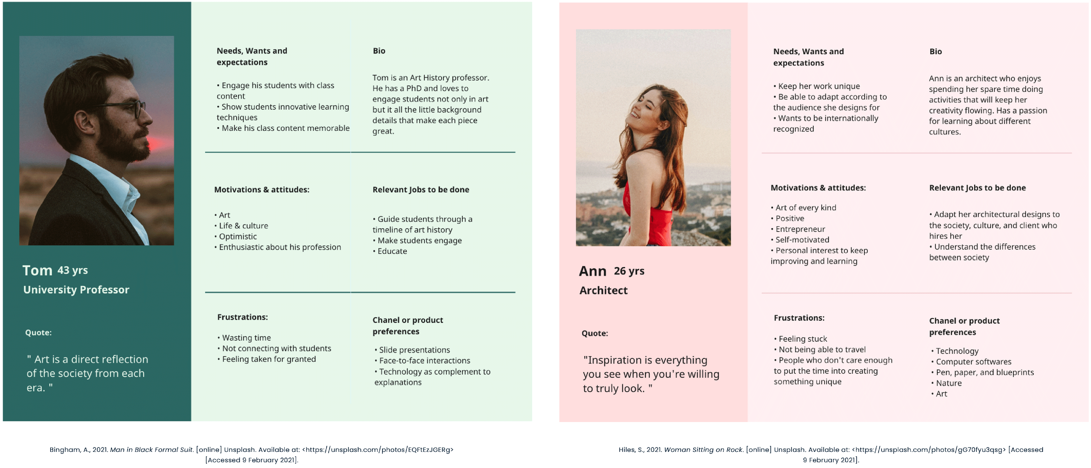
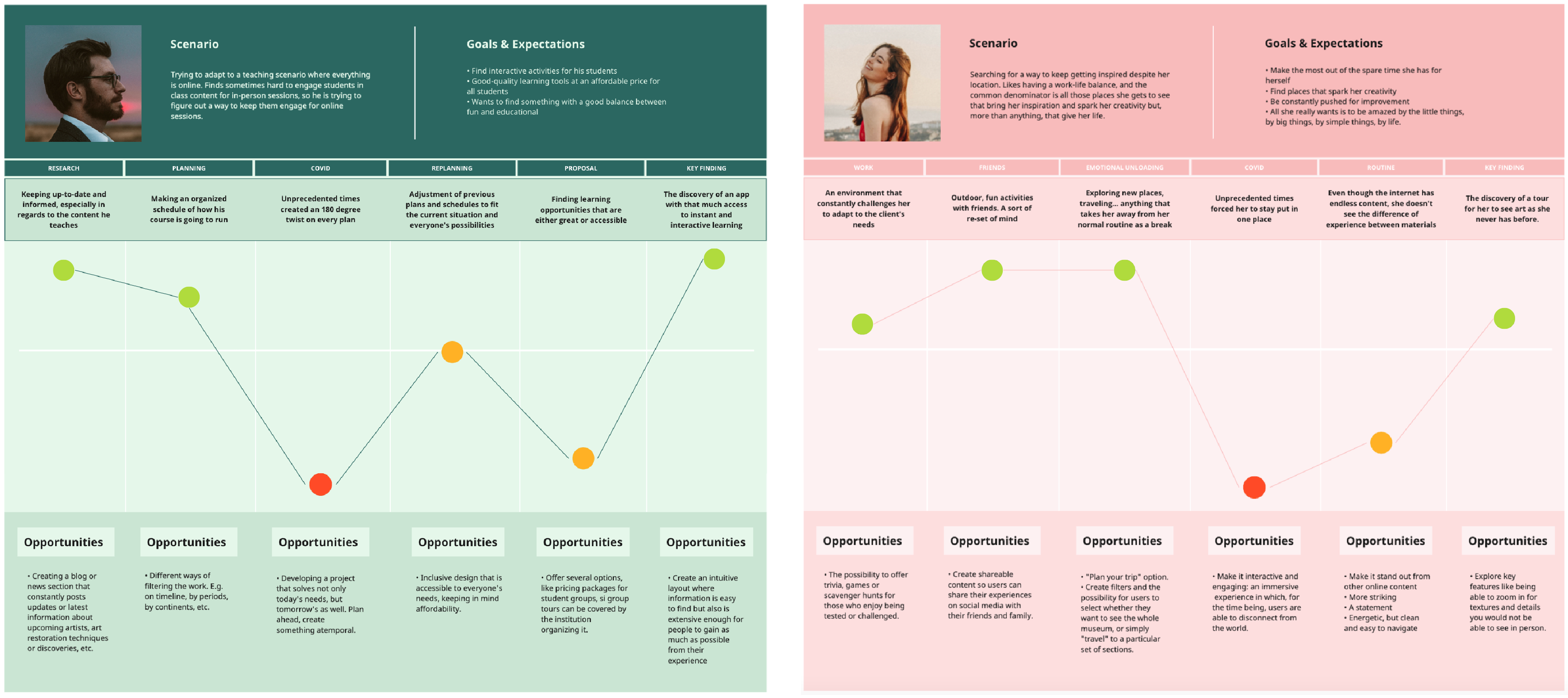
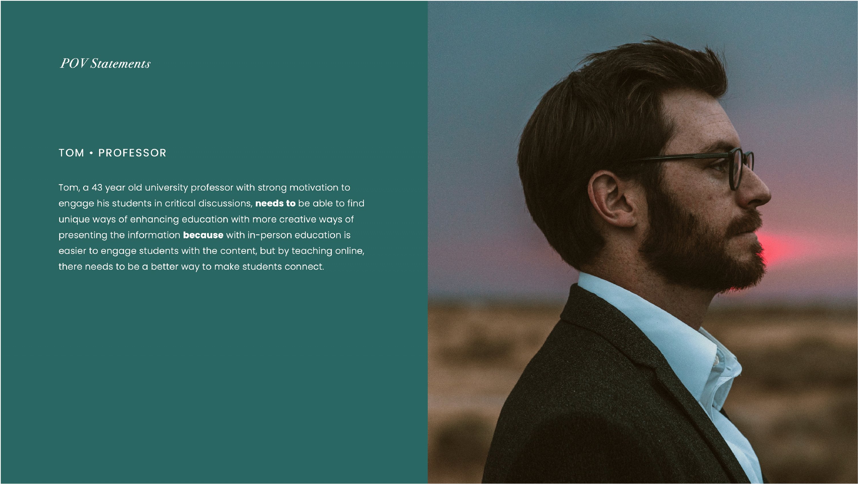
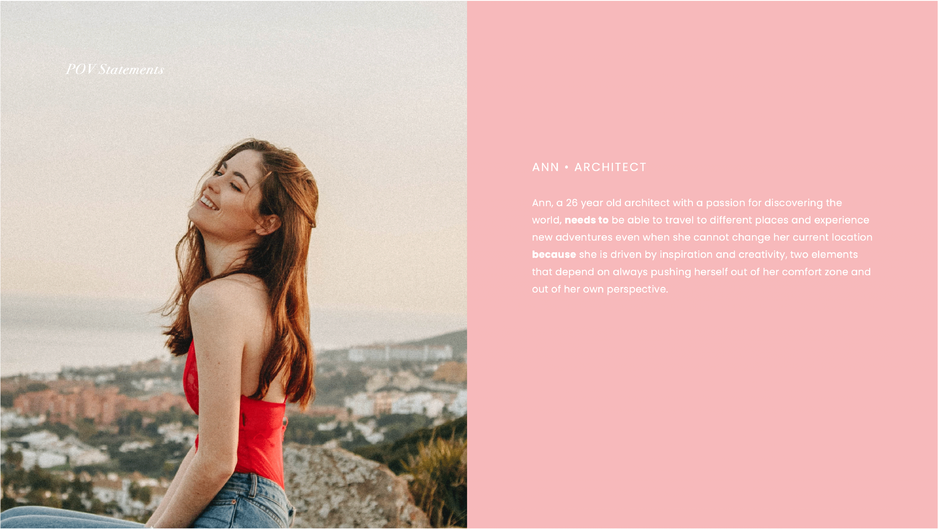
Two comments, from two different participants, stood out on the surveys and became the inspiration and essence of the two personas designed for the project.
|
“The physical buildings are often a clue to the importance of its contents; the reverence for art speaks volumes about a city’s core values and unique history.” - Participant 15 |
“My motivation to visit museums is life itself” - Participant 09 |
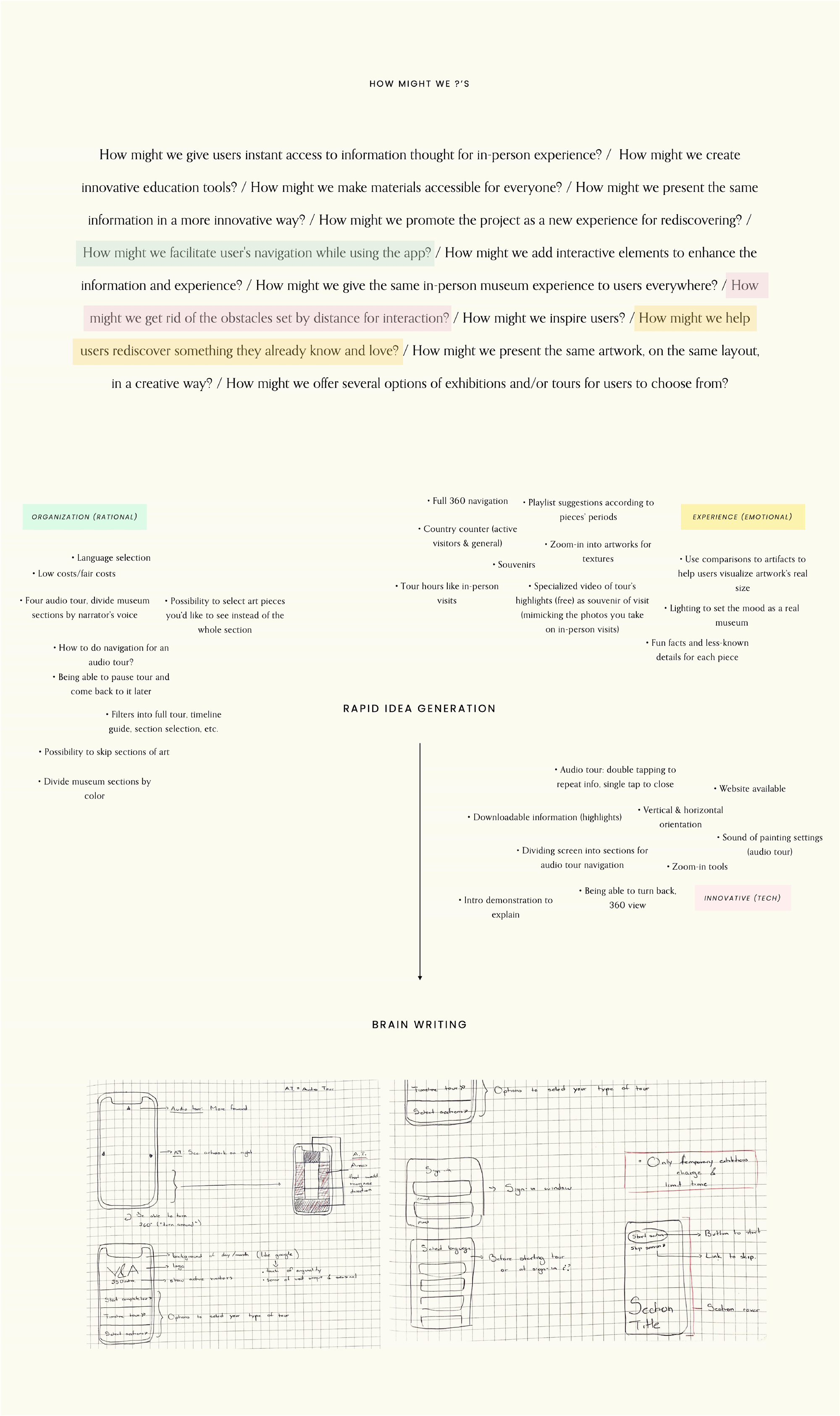
For this stage of the process, a combination of several ideation techniques were employed. The first one was a round of "How Might We" questions in order to get a better understanding of the problems to resolve. A round of rapid idea generation followed, estimulating the generation of plausible solutions. To finalize, a brain writing session took place in order to sketch every idea and analyze their feasibility.
The first step was creating a paper prototype and conducting user testing (through the use of Marvel POP) prior to proceeding with the design of wireframes.
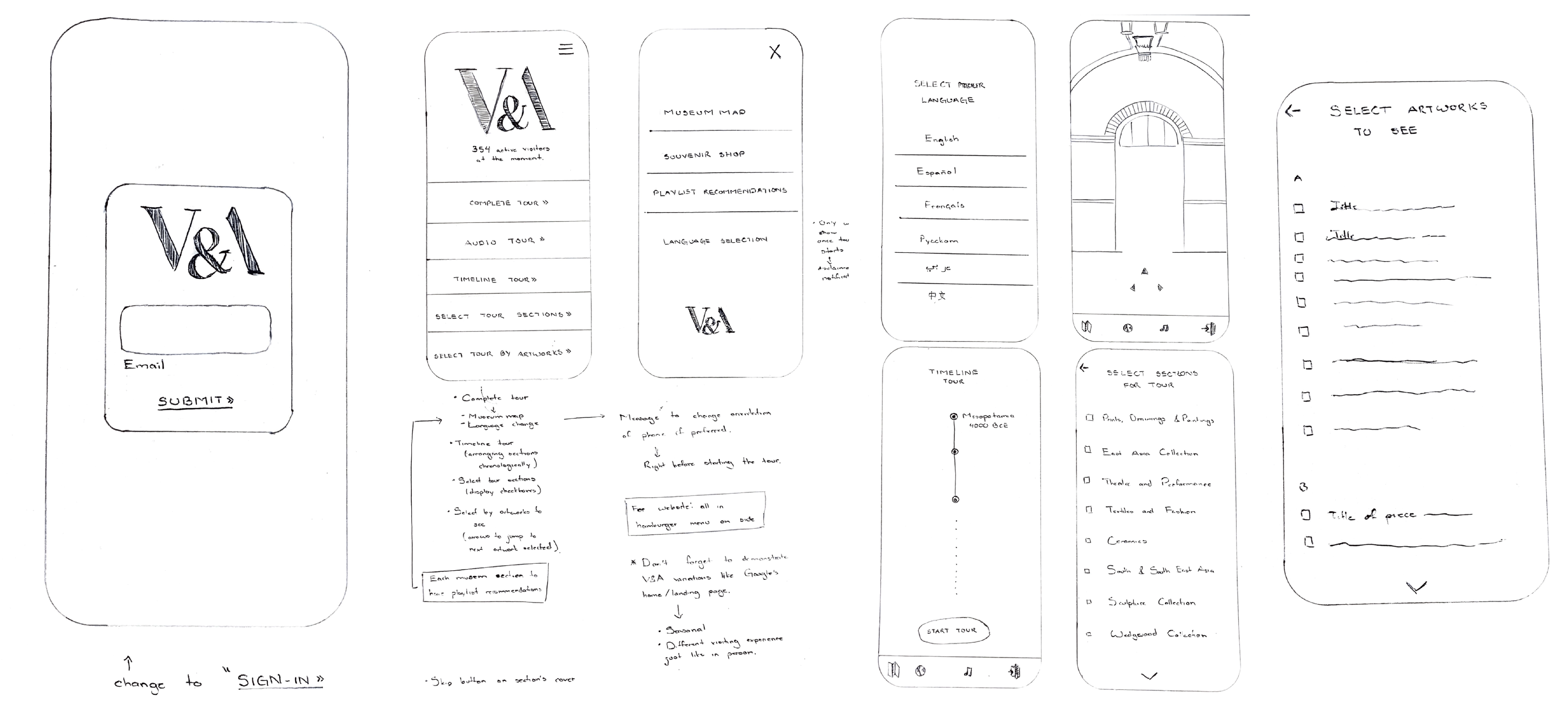
After analyzing the feedback received during testing, the wireframes were designed to get a more intelligible idea of what the end product would look like. Below are a few of the wireframe screens created using AdobeXD, along with blue guidelines of what the interaction between screens would look like.
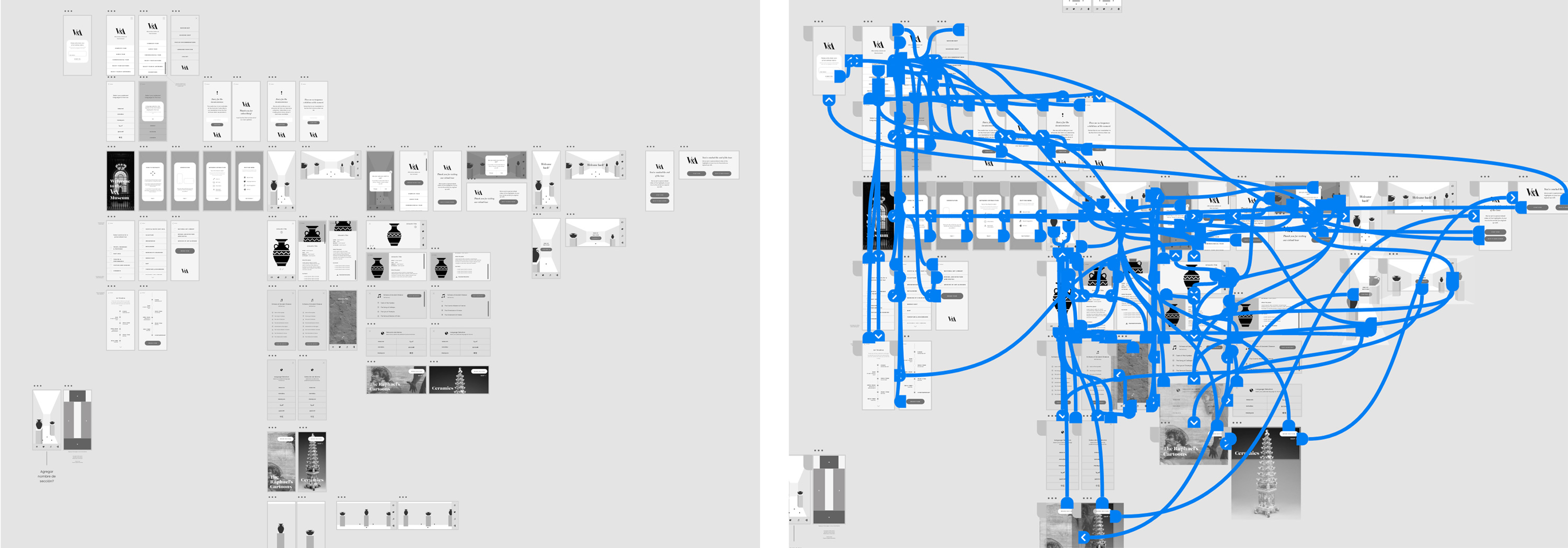
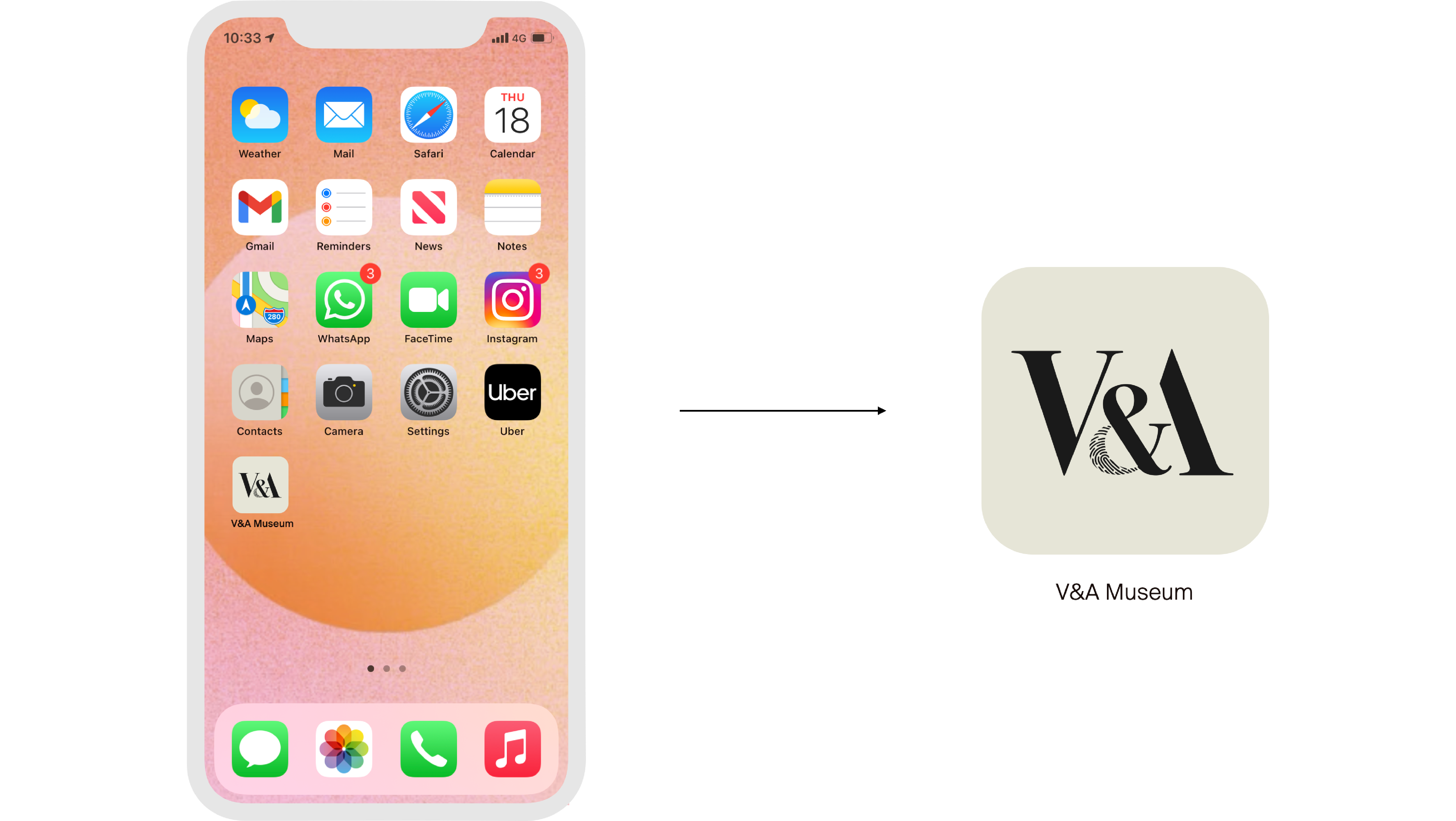
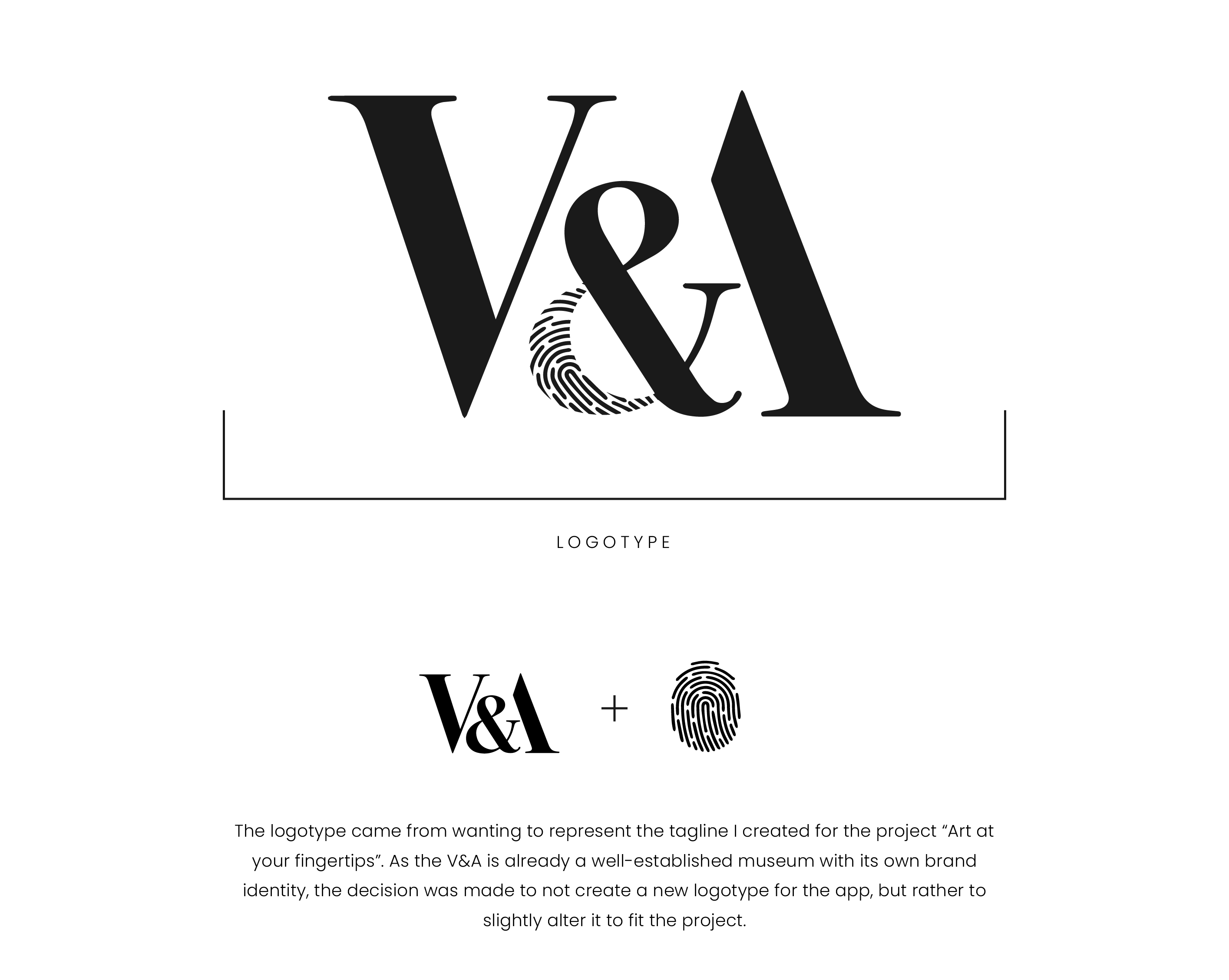
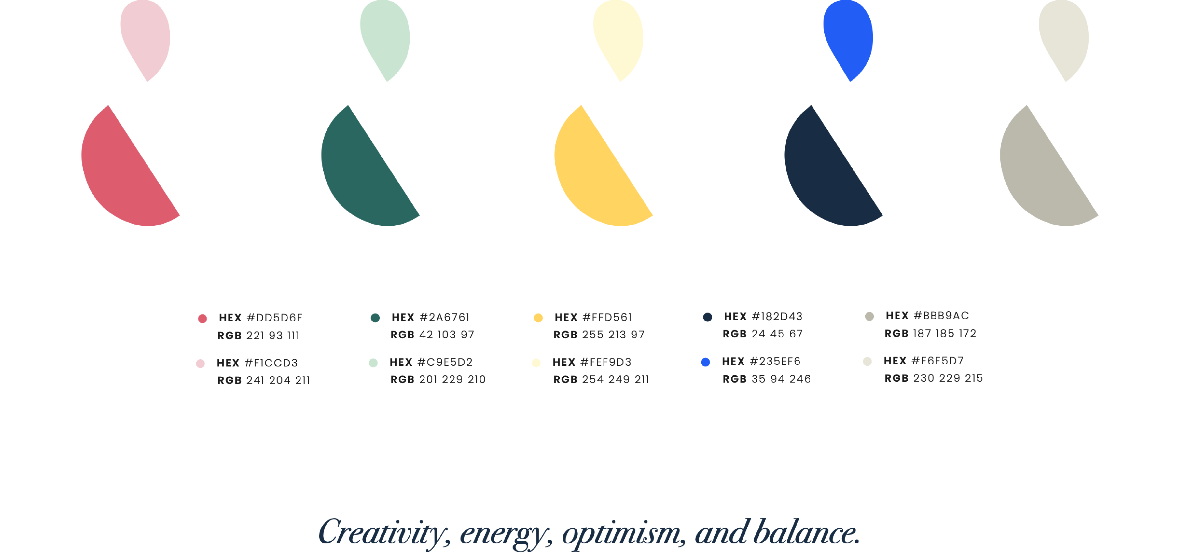
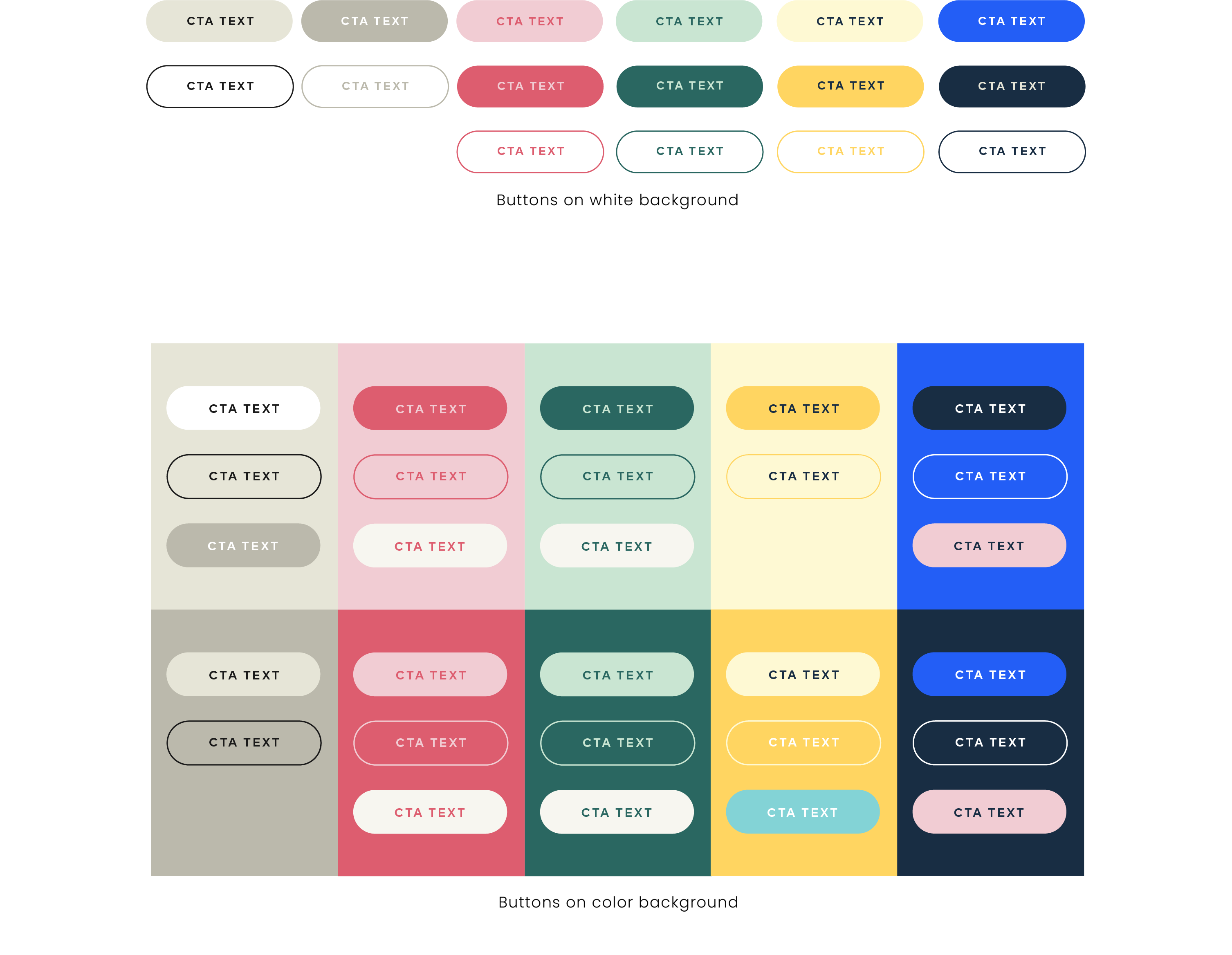
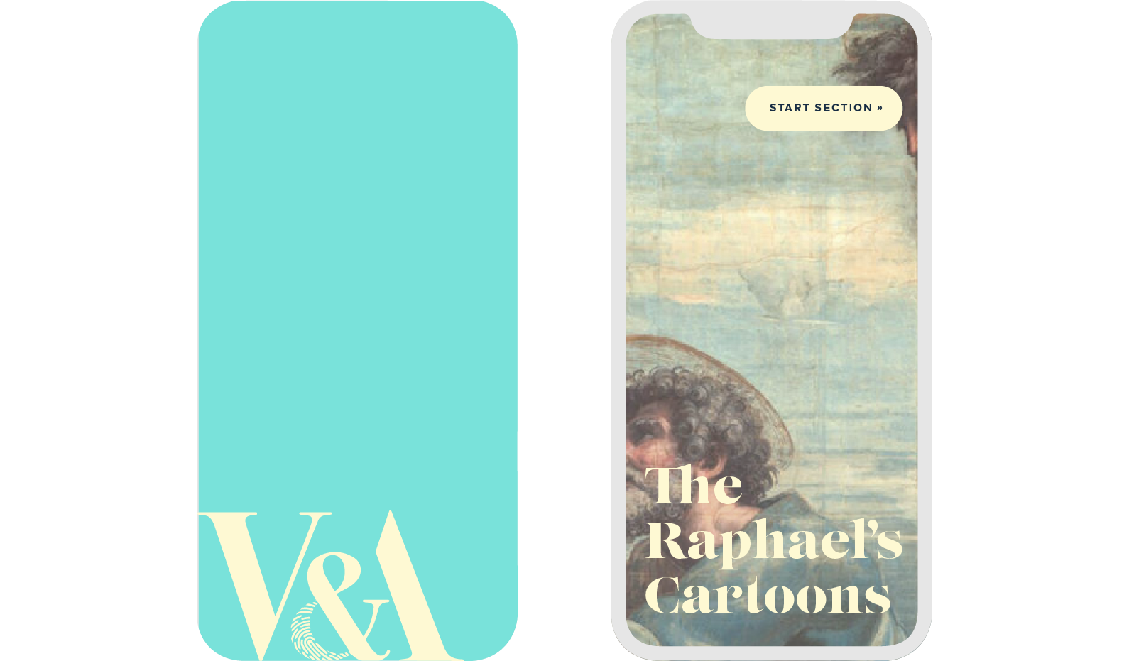
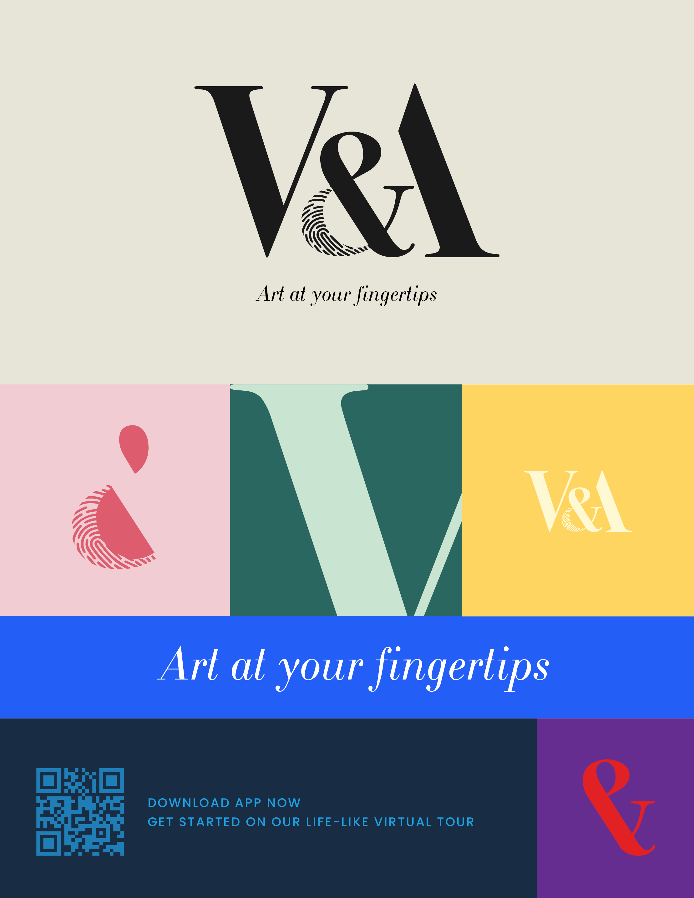
There is another round of user testing taking place at the moment before proceeding with the high-fidelity prototypes and the final round of testing for last iterations. Below are the visual guidelines created for the project.
*Literary review and complete hi-fi screens work were not showcased in this case study.
Intellectual property of Carolina De Alba
©2022