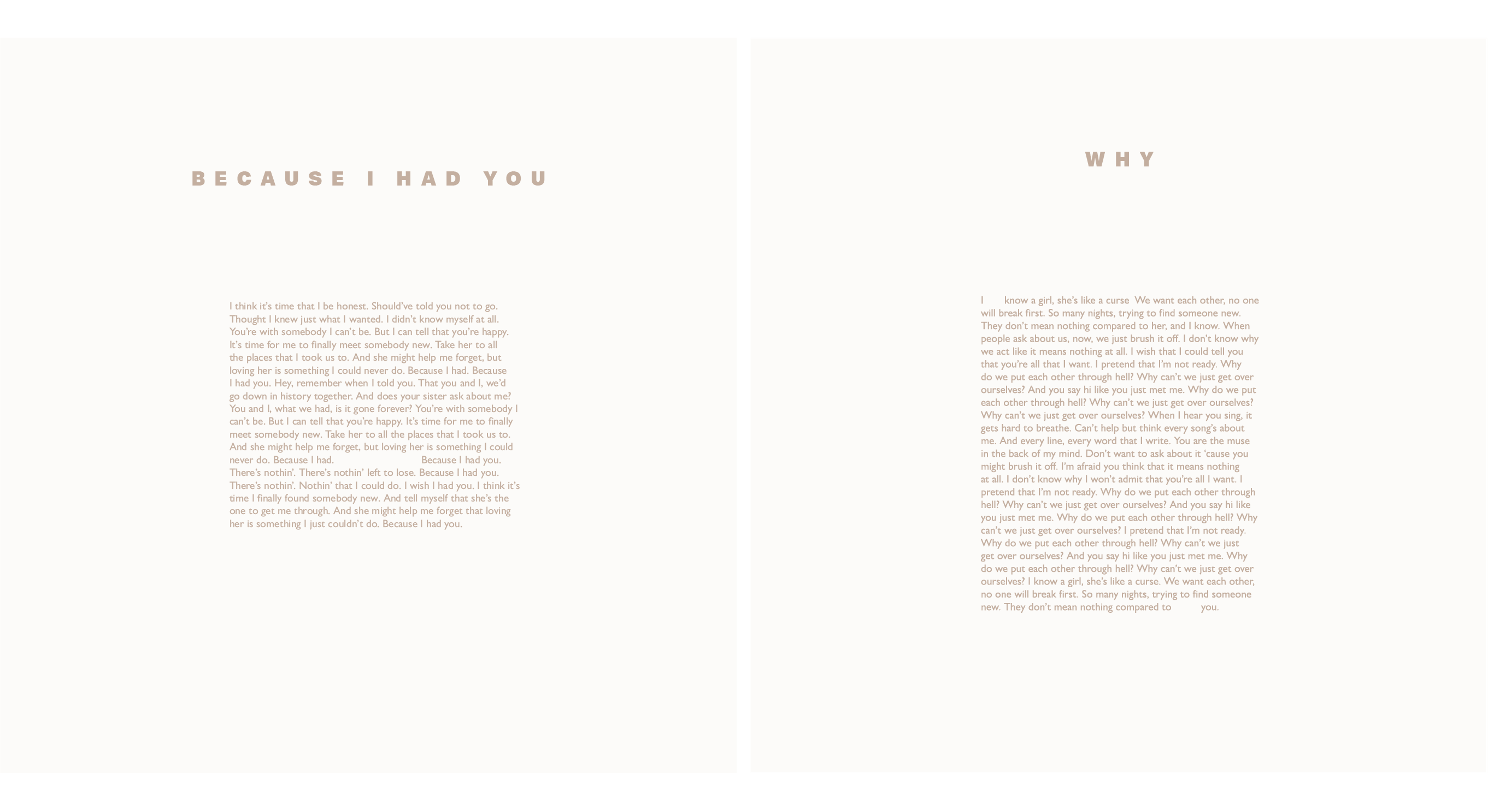
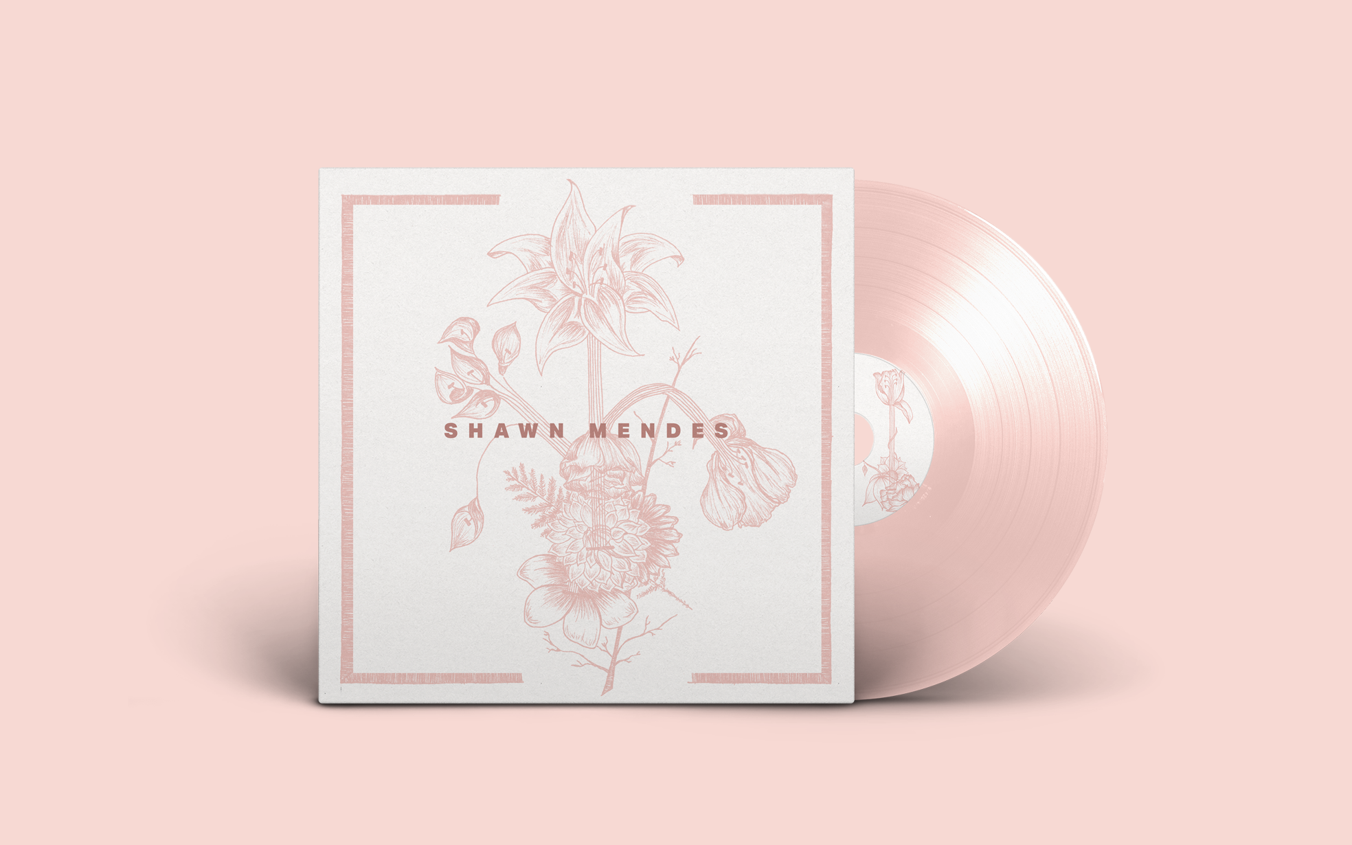
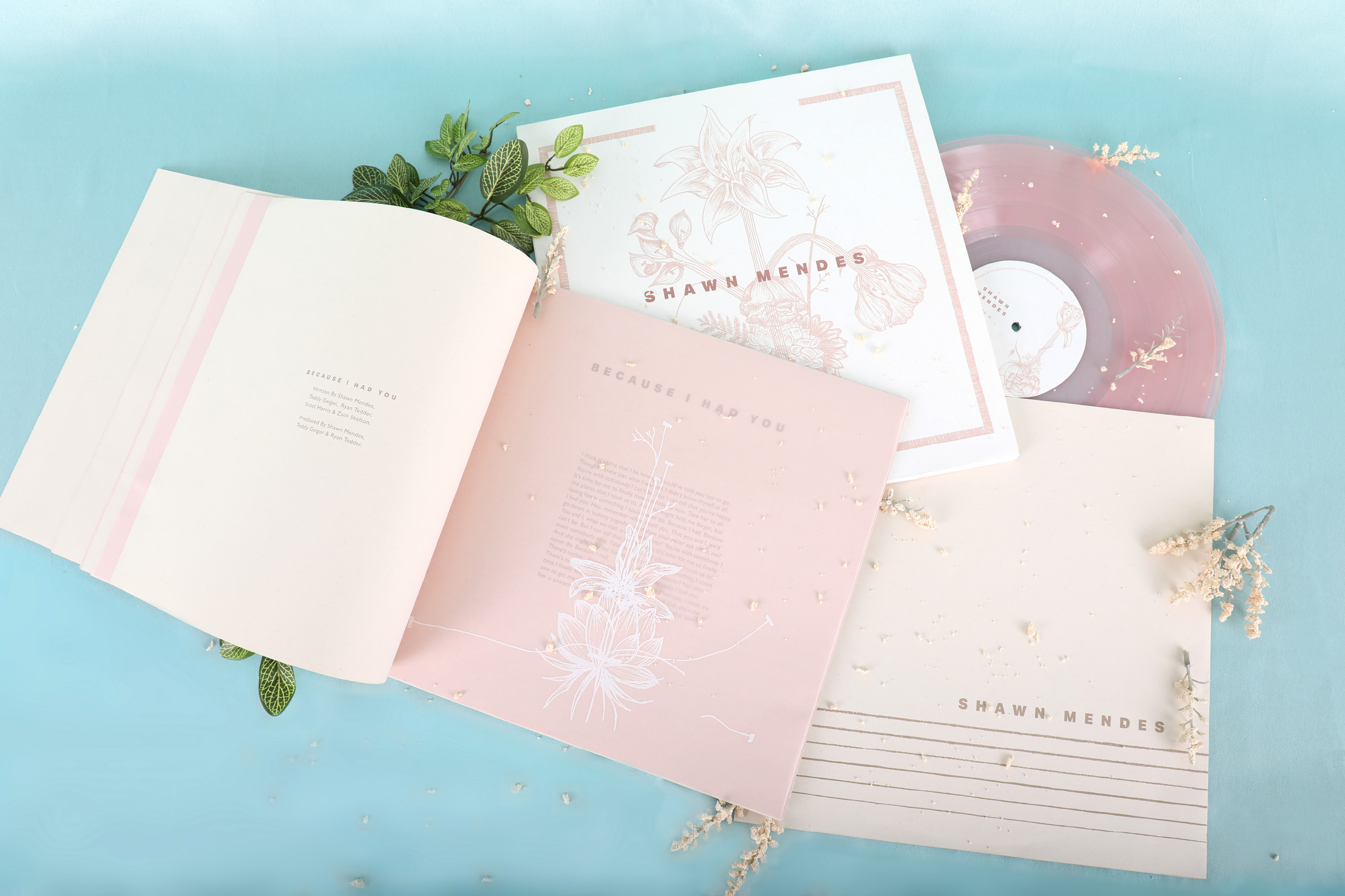
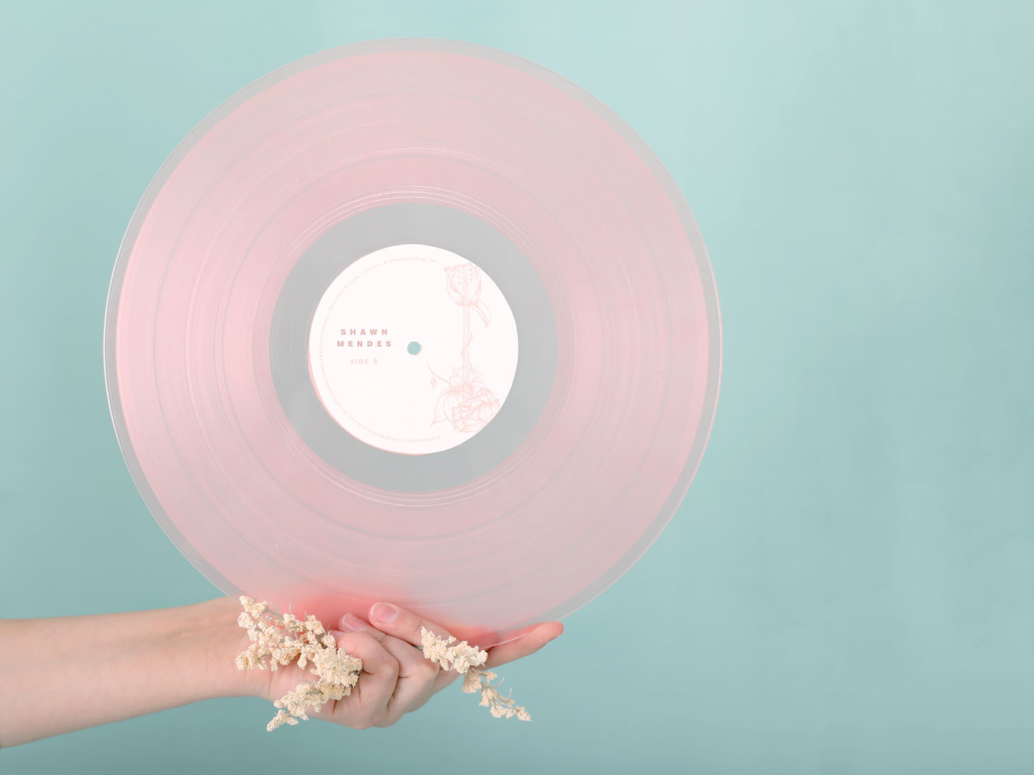
Redesigned the packaging and artwork for Shawn Mendes' self-titled third album. The concept for this project was based on a personal interpretation of portraying the feeling and experience gotten from the music into the visual artwork. The project included a design of a box for the vinyl containting the front and back album design, LP center stickers, lyric book, and sleeves.
The illustrations are a surrealist representation of the soft, delicate and warm tones found on each song.Throughout every song, the acoustic guitar unifies, becomes the most prominent instrument, and establishes the album's style. The visuals are abstract representations a combination of flowers arranged in positions that would form or imply the shape of a guitar, all connected by six strings. A bold, sans-serif typeface was chosen to contrast with the delicate linework of the illustrations. |
|
Sleeve Design Front |
Sleeve Design Back |
The record sleeves have guitar strings illustrations (three nylon, three steel), and on the back of the sleeve, the strings break into flowers. Overall, all the work created for the project was intendend to portray harmony and balance through, and between, simplicity and emotion.
Concrete Poetry /The project also includes the design for the lyric book. The album includes fourteen different songs, each one of them with a unique illustration representative of their lyrics and meaning. None of the illustrations created were repeated throughout the album. In addition, each song's meaning was visually represented on the lyrics' page in the style of concrete poetry.All the elements were printed on French paper and light-pink vellum. For the lyric book, the spreads would be divided like this: on the left you would be able to find the production credits for the song, and on the right you would find the song's illustration printed with white ink on vellum paper, showing through its concrete-poetry-styled lyrics. |
