|
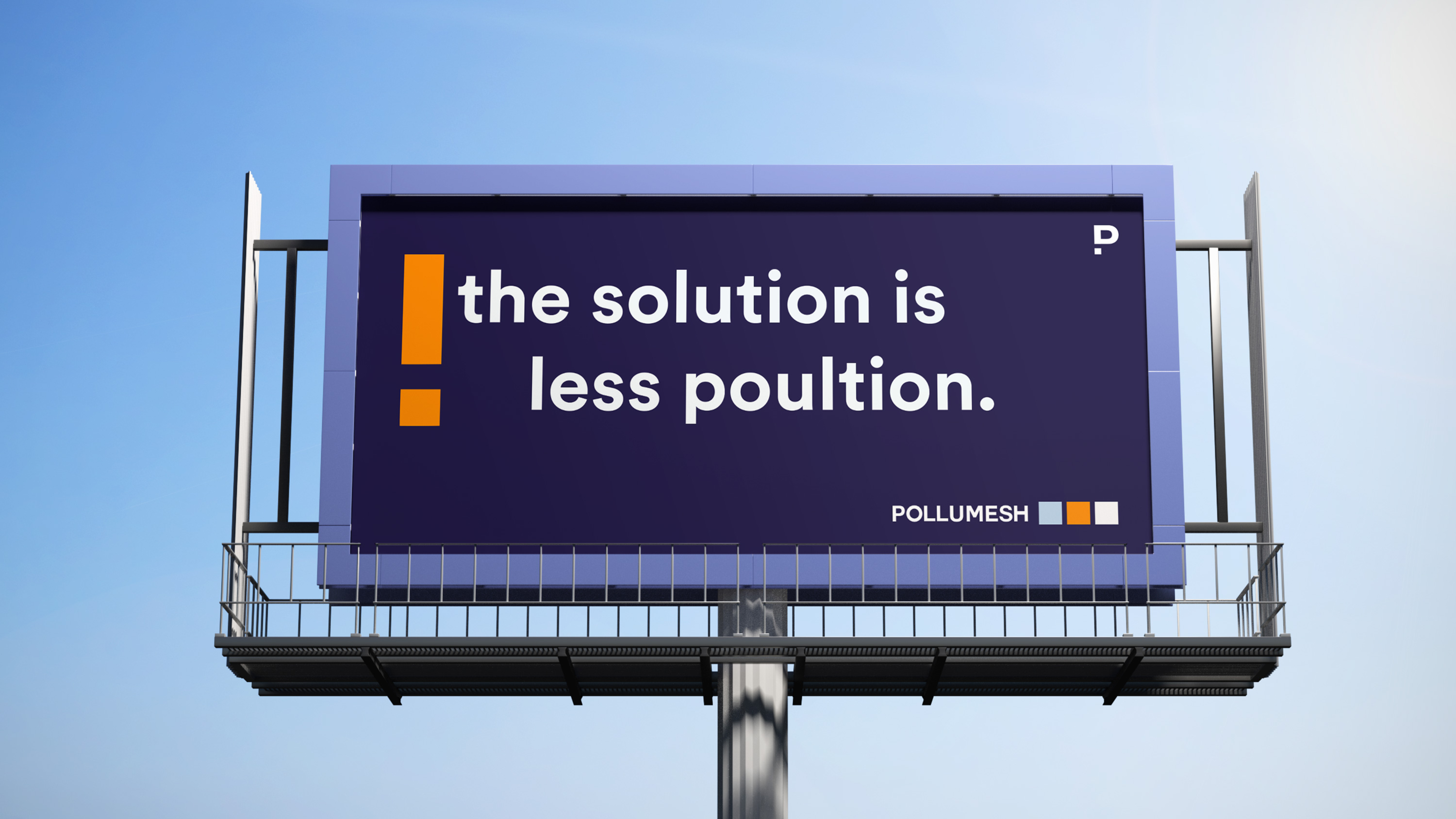
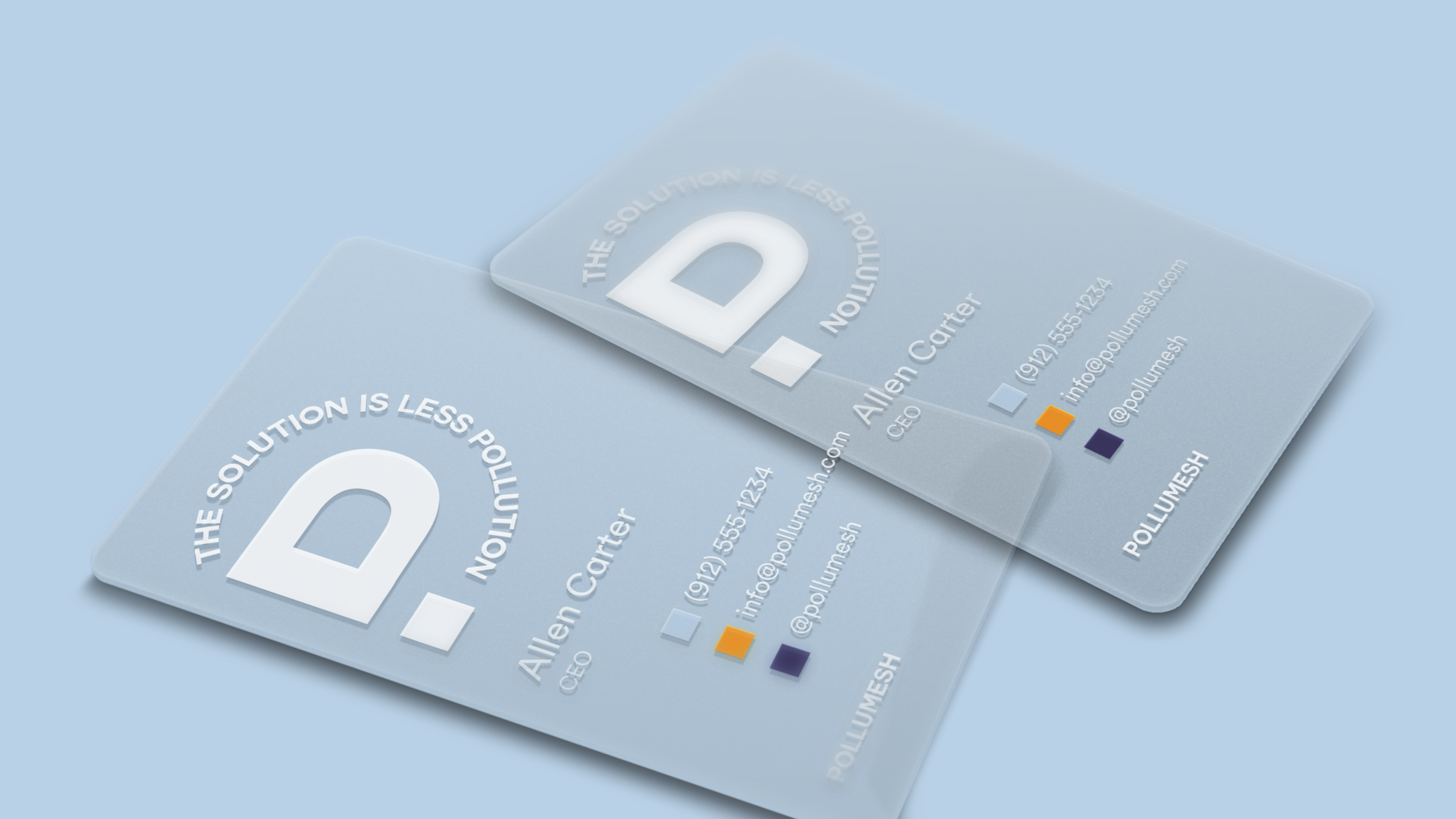
The inspiration for this branding was born from the different elements of the campaign (sustainability, technology, innovation, and design). The approach to the P is supposed to create an exclamation sign, emphasizing the importance on the subject. The squares as utilized as graphic resources to represent all the brand's values. The Solution is Less PollutionI created the slogan "The Solution is Less Pollution" to accompany the brand's name and identity. As a short, memorable statement, it conveys the mission of the brand with every application. |
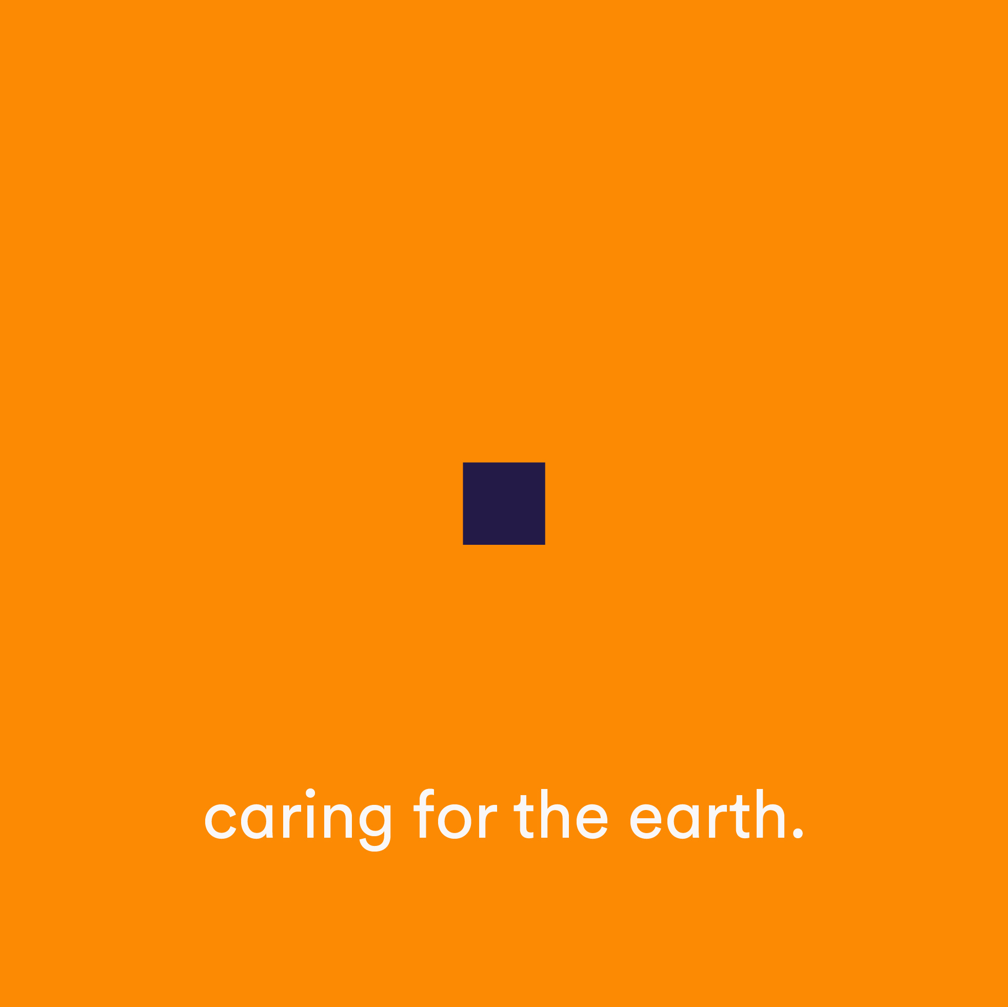
The color palette represents is composed by young, energetic colors that portray a modern, contemporary approach. The softness in the blue reflects a serence and clean essence to the brand.


|

|
|
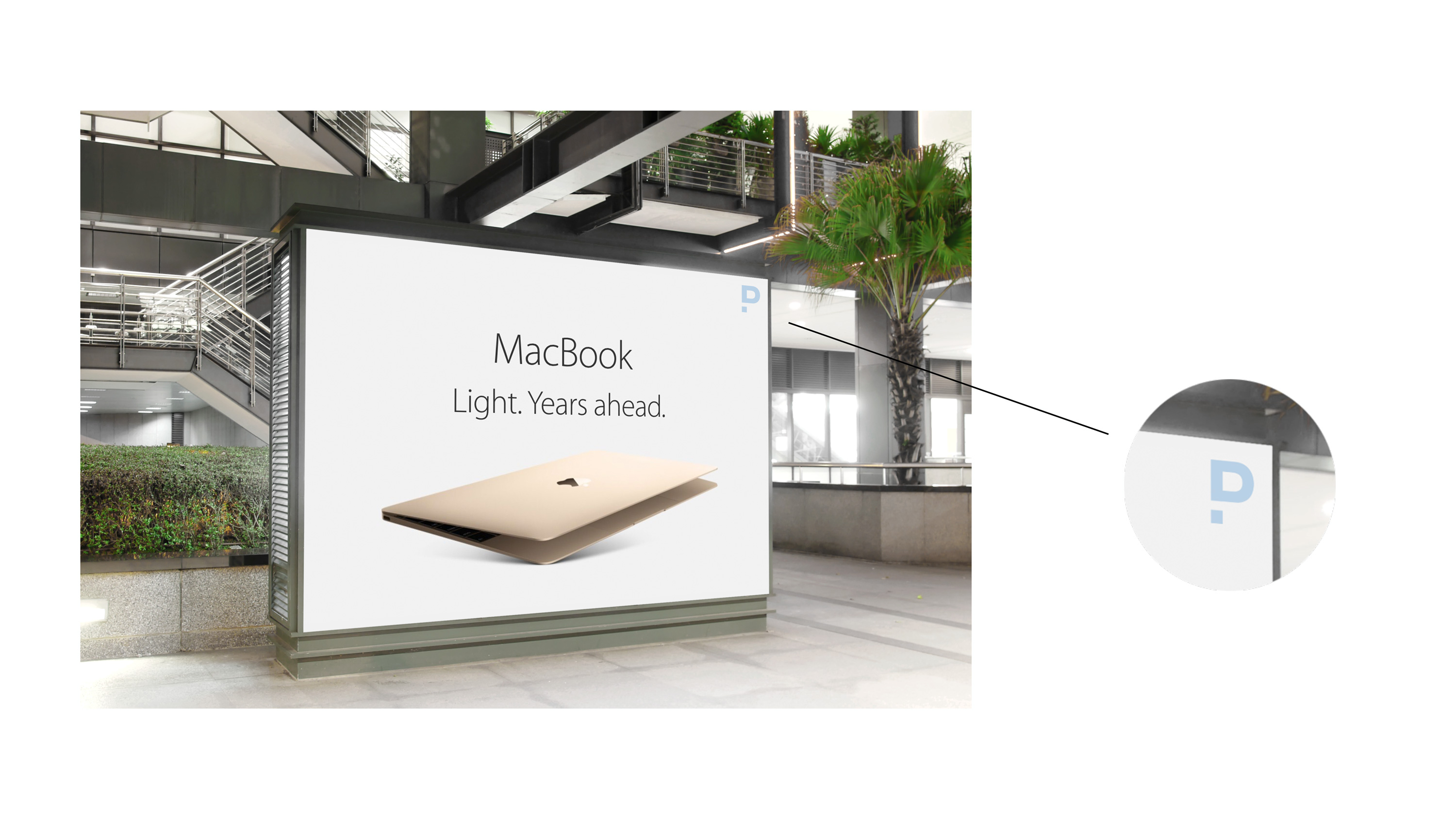
Some of the packaging elements designed were main application elements were business cards and how the brand will stand within panoramics that were done with their materials. As shown below, the business cards are set to be printed on clear acrylic material to reflect the mission of the brand: transparent and clean purpose and air. The panoramics will include a very discrete positioning of the logo so viewers can identify which brands are working towards bettering the enviornment.