

Inspired by the current situation in the world, choosing brands and the setting of an event known for bringing different cultures and communities together—Coca-Cola and the FIFA World Cup. This project reminds people that we are a lot closer than what we think, and gives the user a taste of other cultures by allowing them to walk into a different reality.

The research was based on two central themes: finding what it is that gives meaning to a place, and how/why do people connect to certain things.
1. Meaning of a Place"A place is distinguished by its people, markets, governments, and institutions, as much as it is by its physical landscape and natural resources, transportation systems (including streets and roads), buildings, and boundaries. Like livability and sustainability, place is an ensemble concept." National Research Council et al. (2002). 'Community and Quality of Life: Data Needs for Informed Decision Making.' National Academies Press. "The character of a place, its identity, and its people's sense of rootedness are shaped by interactions within the place and with other places... In adition, places evolve over time, so connections across time are also important." National Research Council (2002, p. 55-56) |

2. Community + Connecting
|
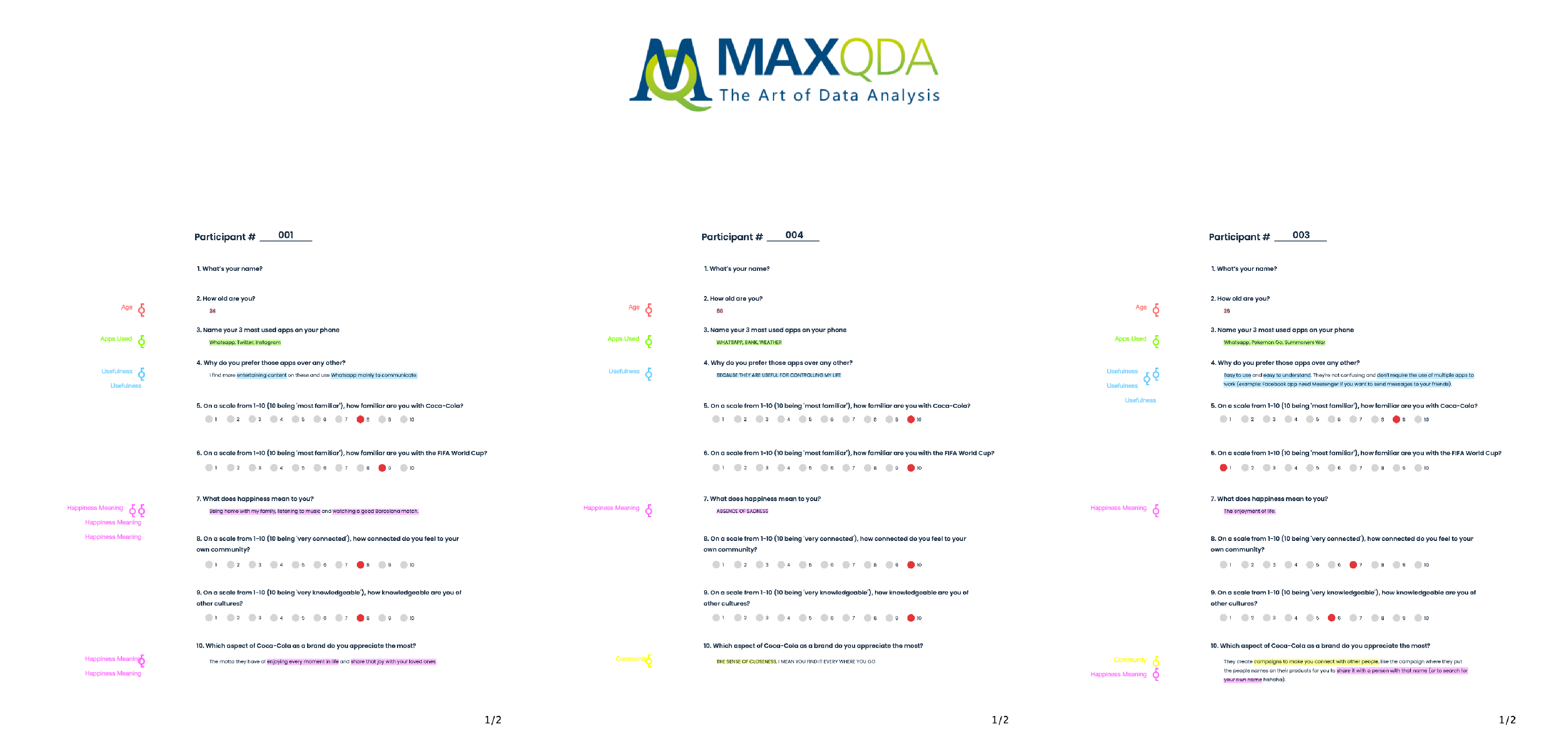
Primary research comprised eighteen surveys that gathered quantifiable data, collecting information on consumers' perception of the brands, important values, their community, product and device importance, etc.
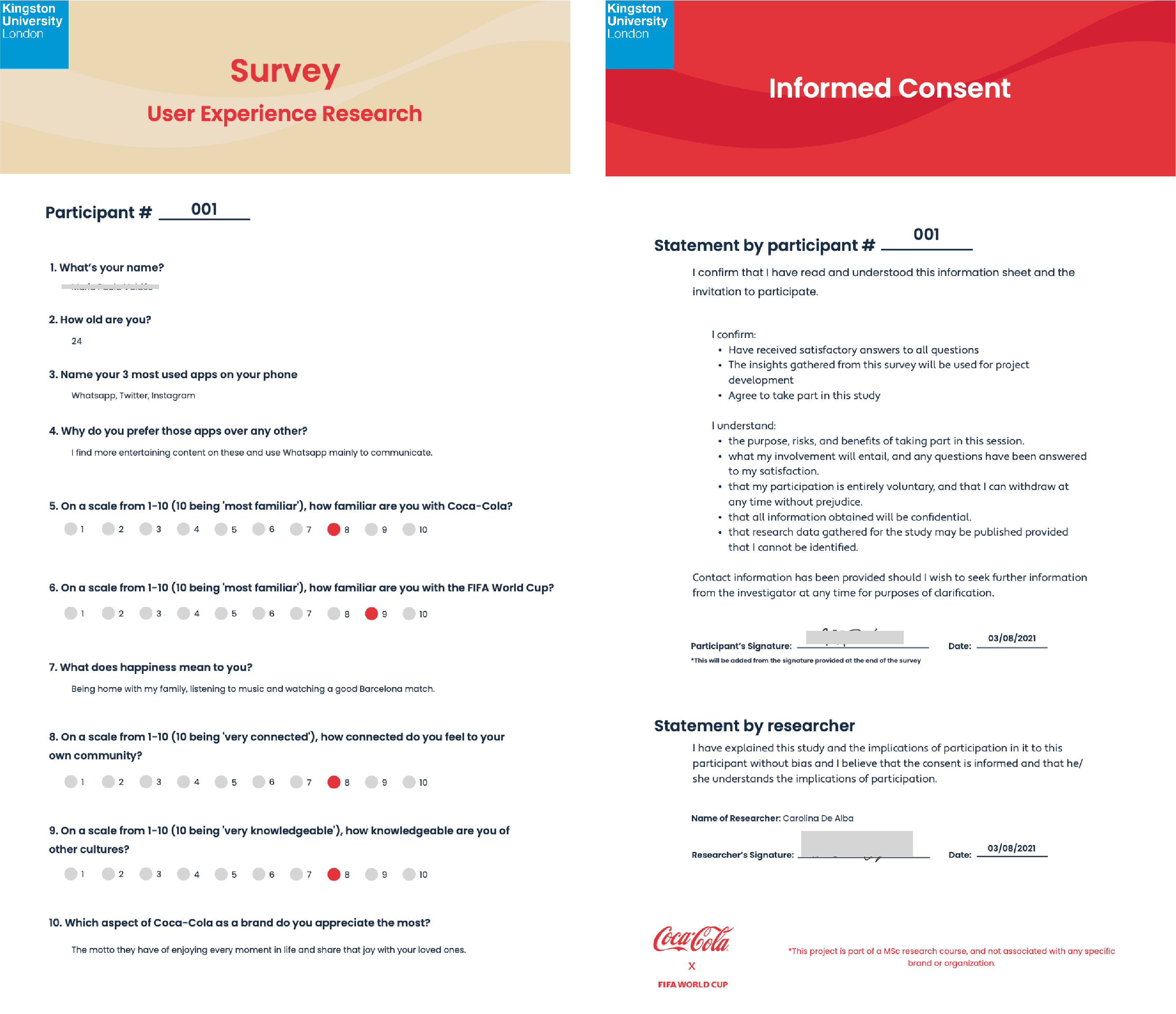
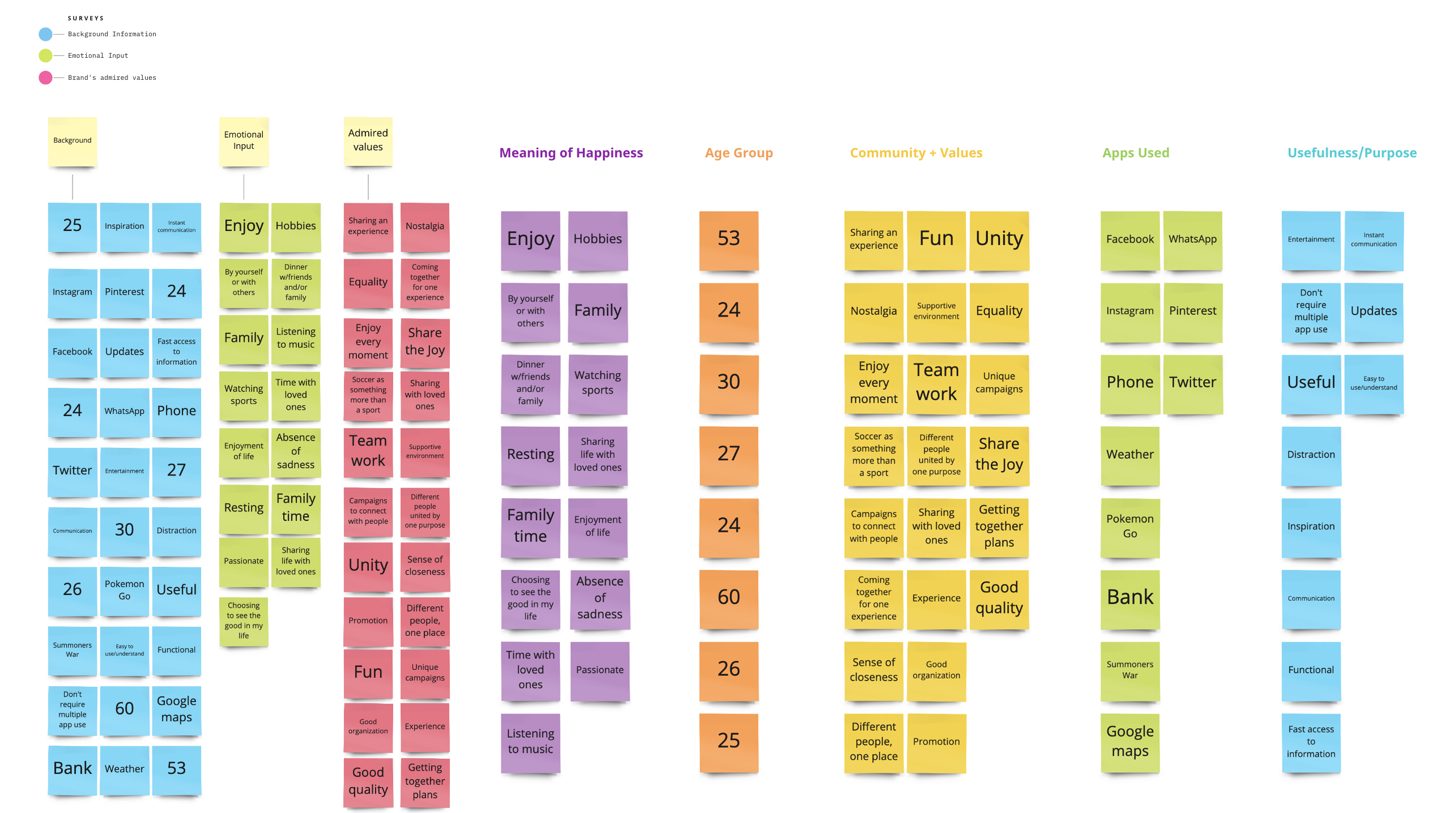
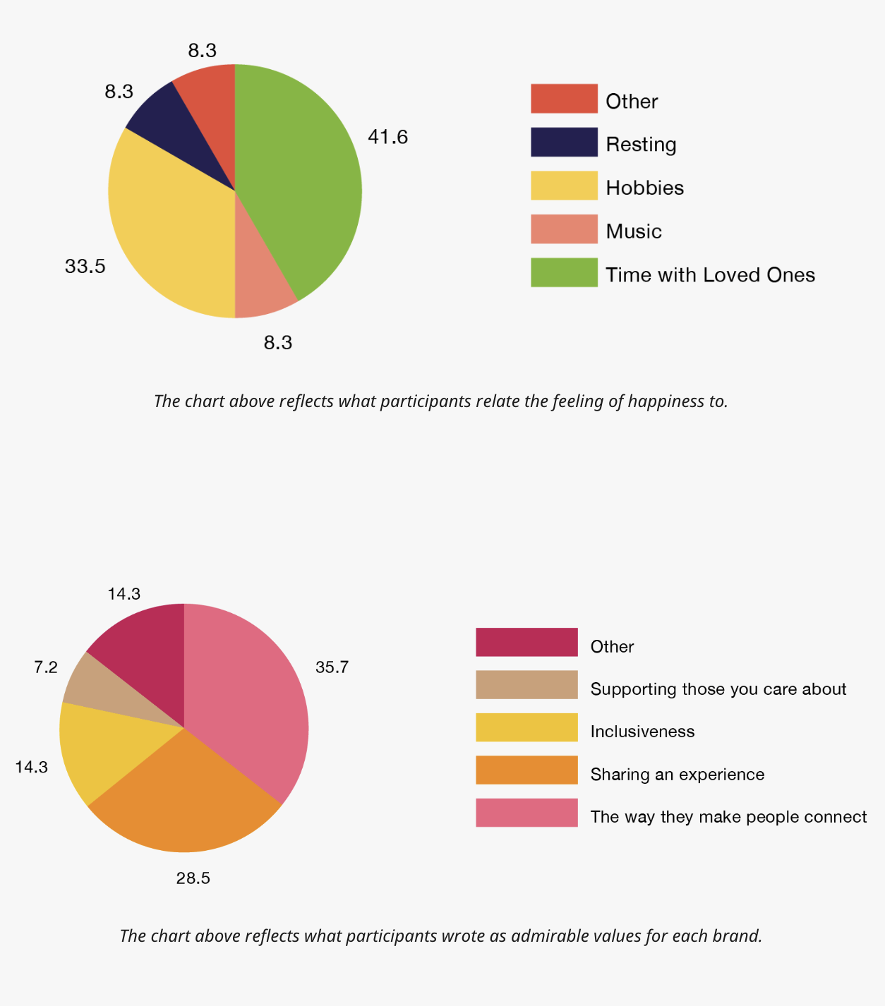
The MAXQDA software was utilized to analyze the information gathered from the participants. Consistent themes were identified on the answers of the survey, leading to a precise affinity diagram followed by a thematic analysis of the data. The key findings presented on the charts below reinforced the setting of this project for Coca-Cola on an event such as the World Cup.

|
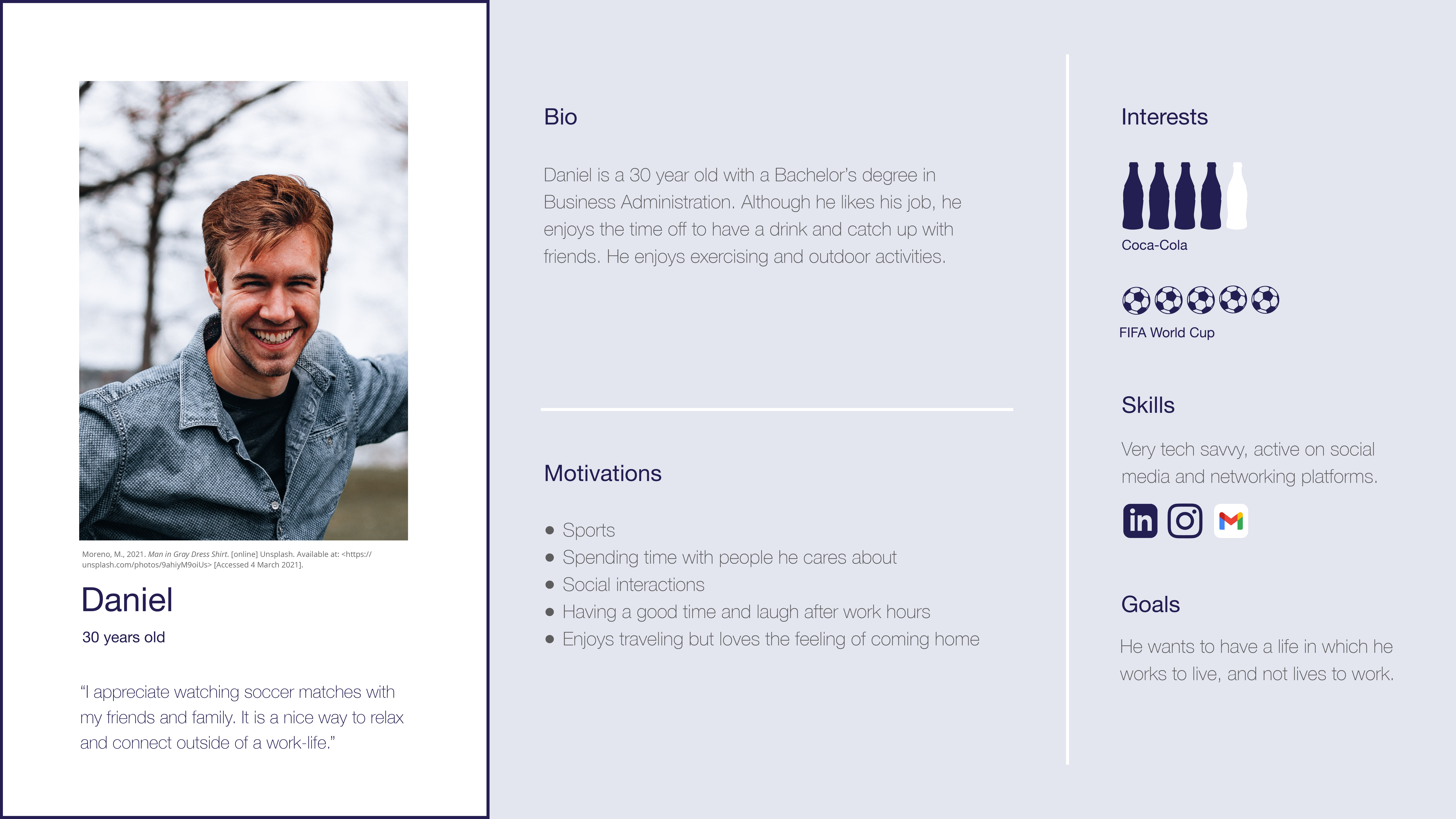
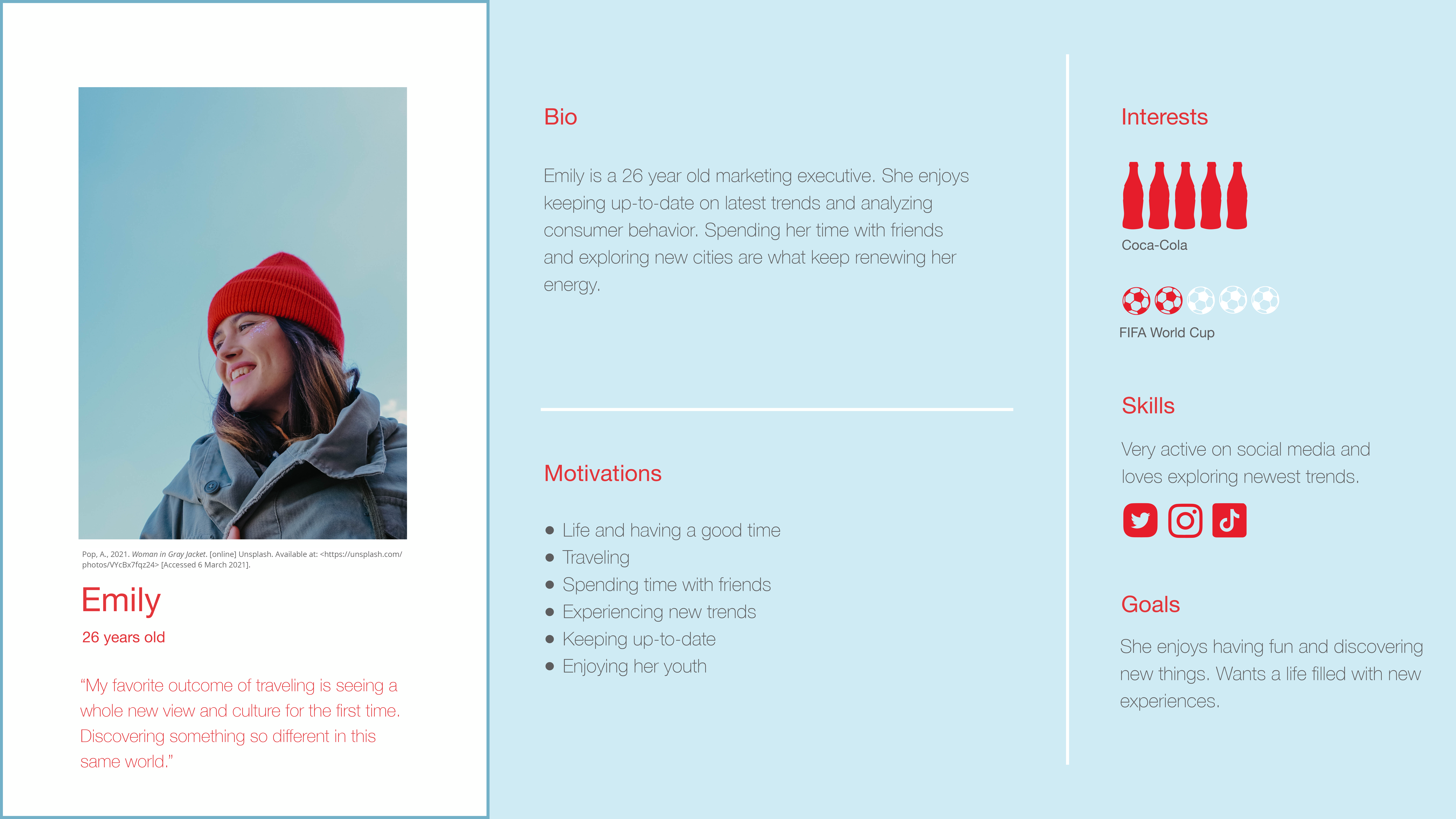
These findings guided the focus to an audience of younger adults, and inspired the creation of the following two user personas.
The MAXQDA software was utilized to analyze the information gathered from the participants. Consistent themes were identified on the answers of the survey, leading to a precise affinity diagram followed by a thematic analysis of the data. The key findings presented on the charts below reinforced the setting of this project for Coca-Cola on an event such as the World Cup.
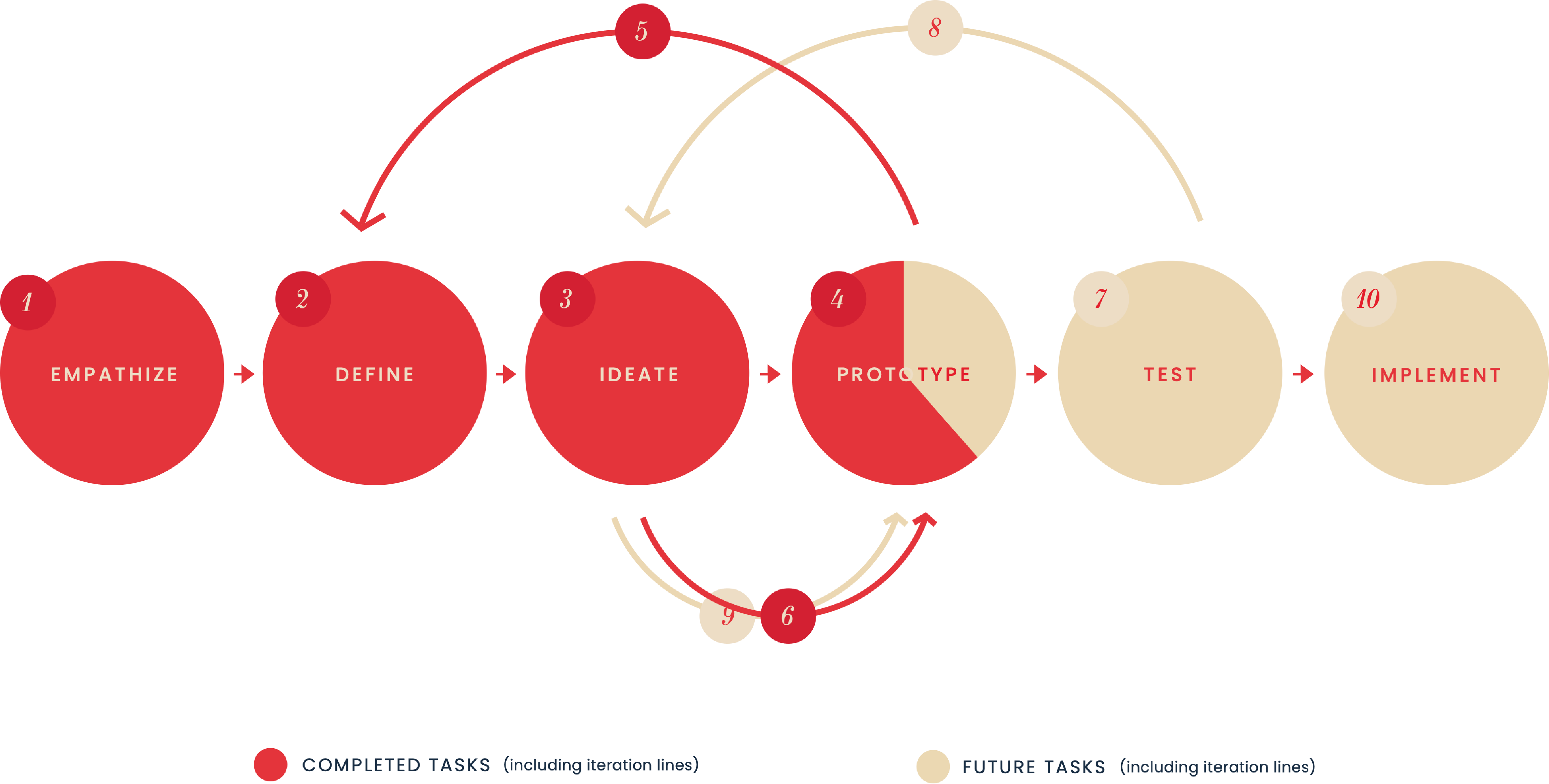
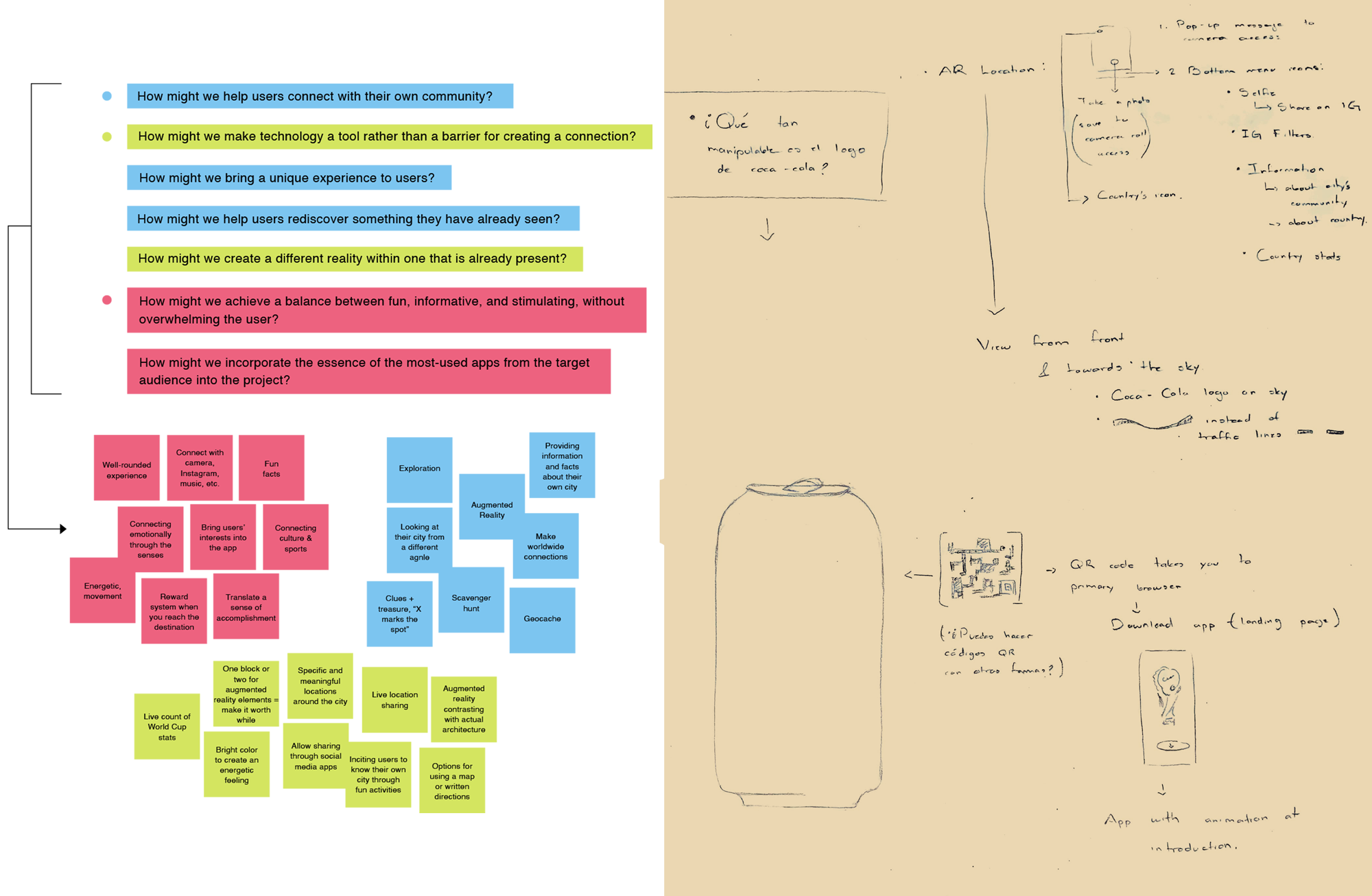
Finally, both techniques were complemented with a Brain Writing session in which all ideas were sketched out thoroughly to analyze their feasibility and purpose.
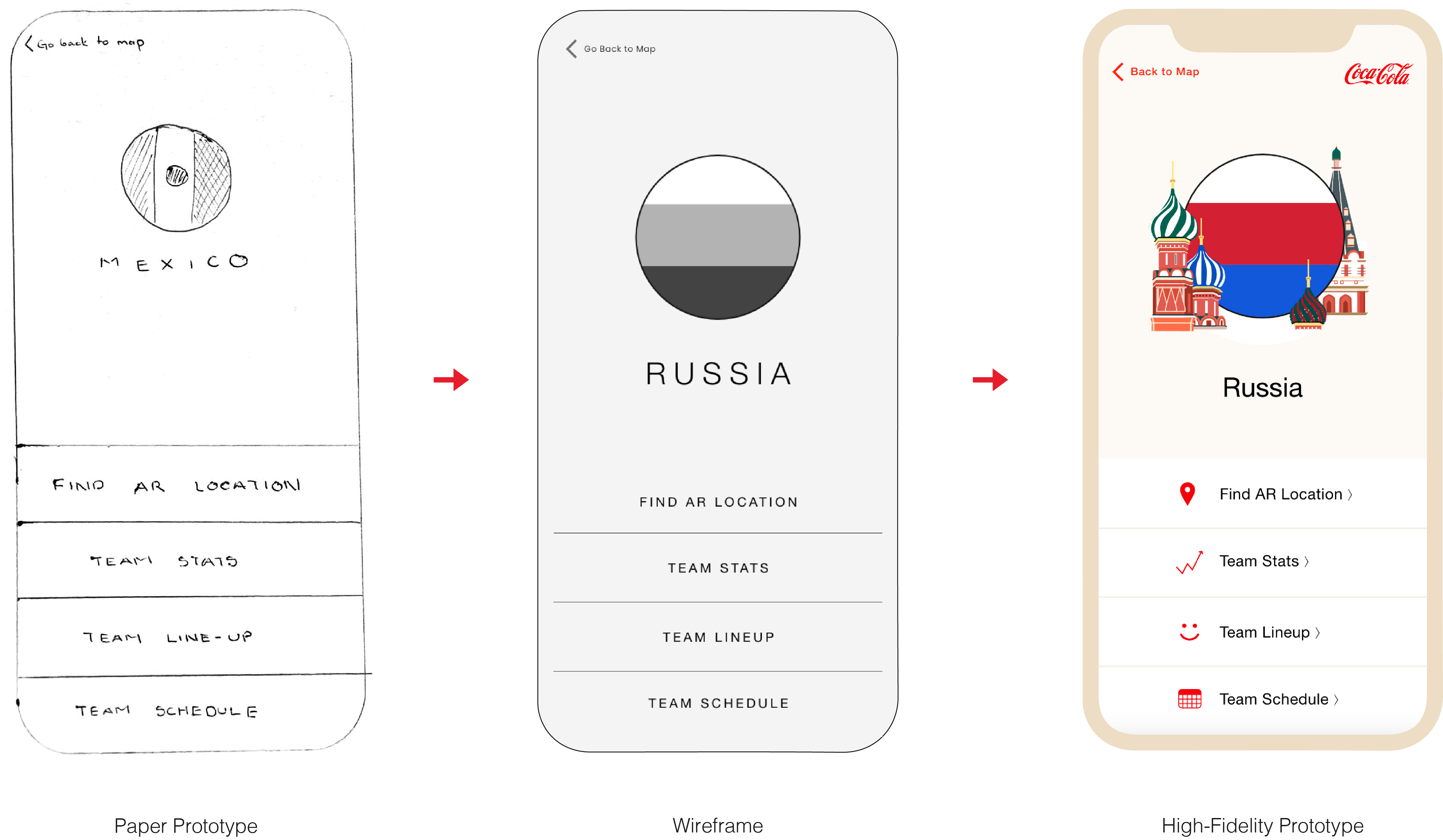
Coca-Cola's philosophy and brand guidelines were taken as reference for prototyping.
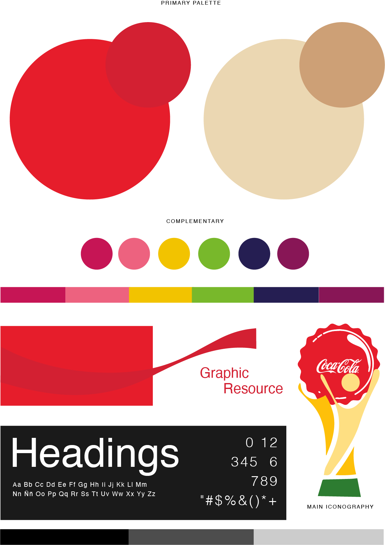

|
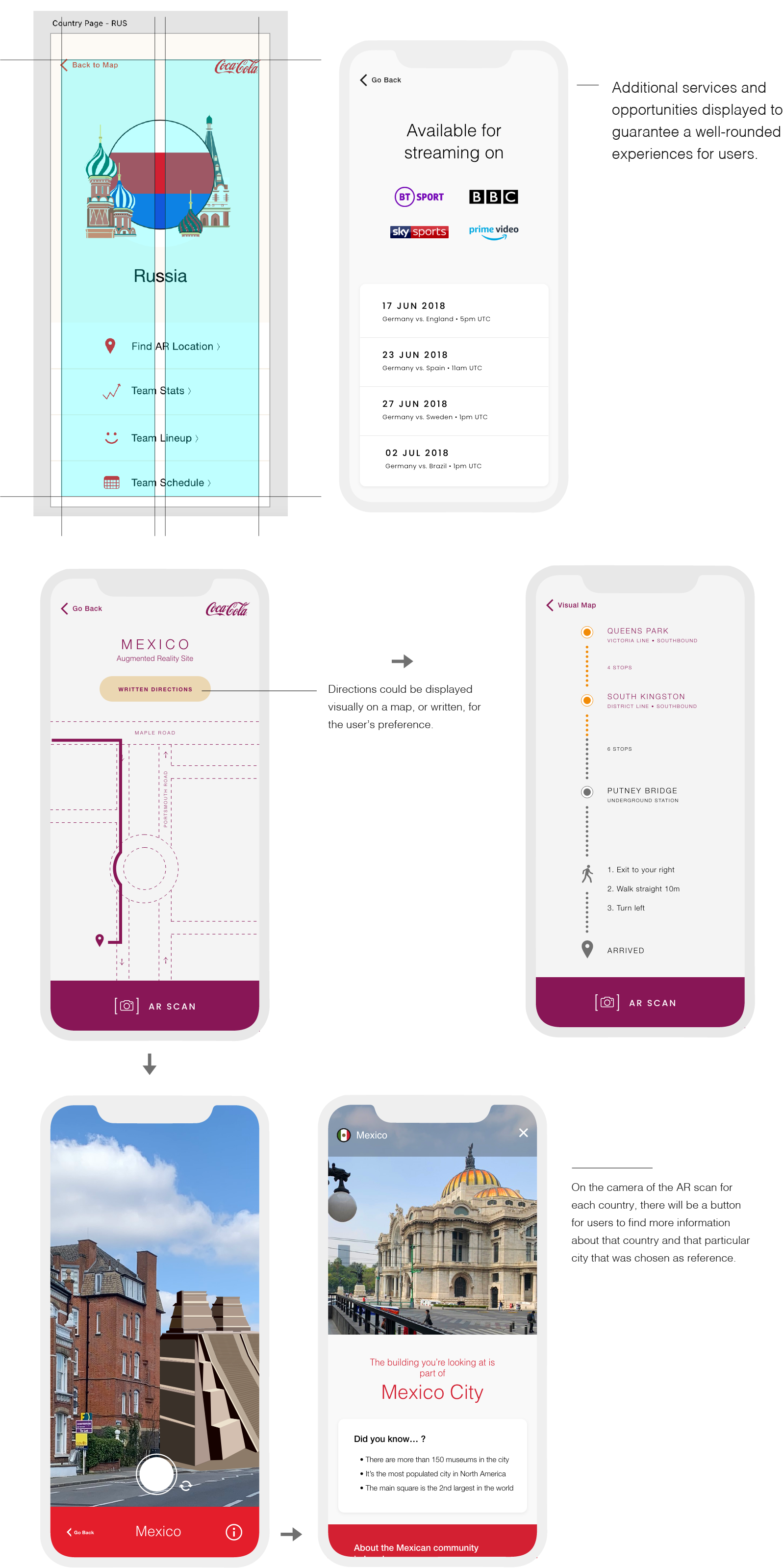
The project includes two types of design: packaging and app. The design on cans will correspond to each country participating on the World Cup, and will include a QR code you could scan. In the app you’ll find the necessary information to get to the AR location.
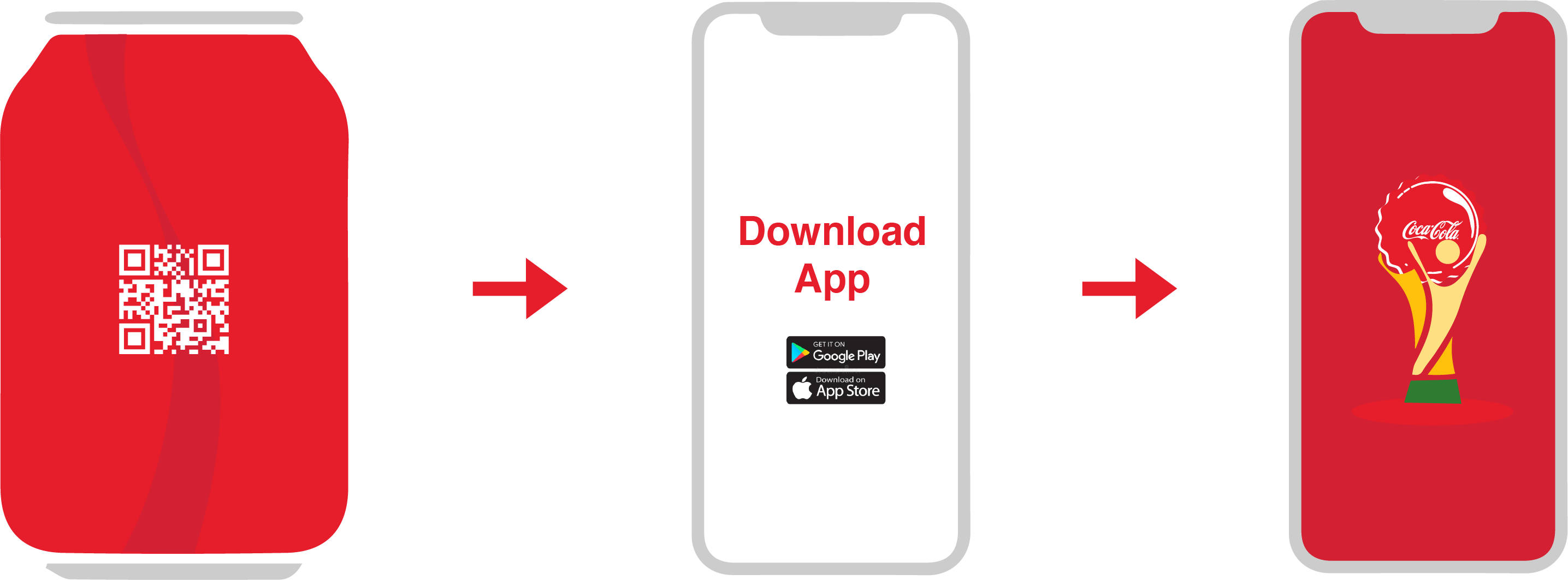
Illustrations created by: Carolina De Alba
Animation produced by: Cynthia Valdés (cynthiavaldesfx@gmail.com)
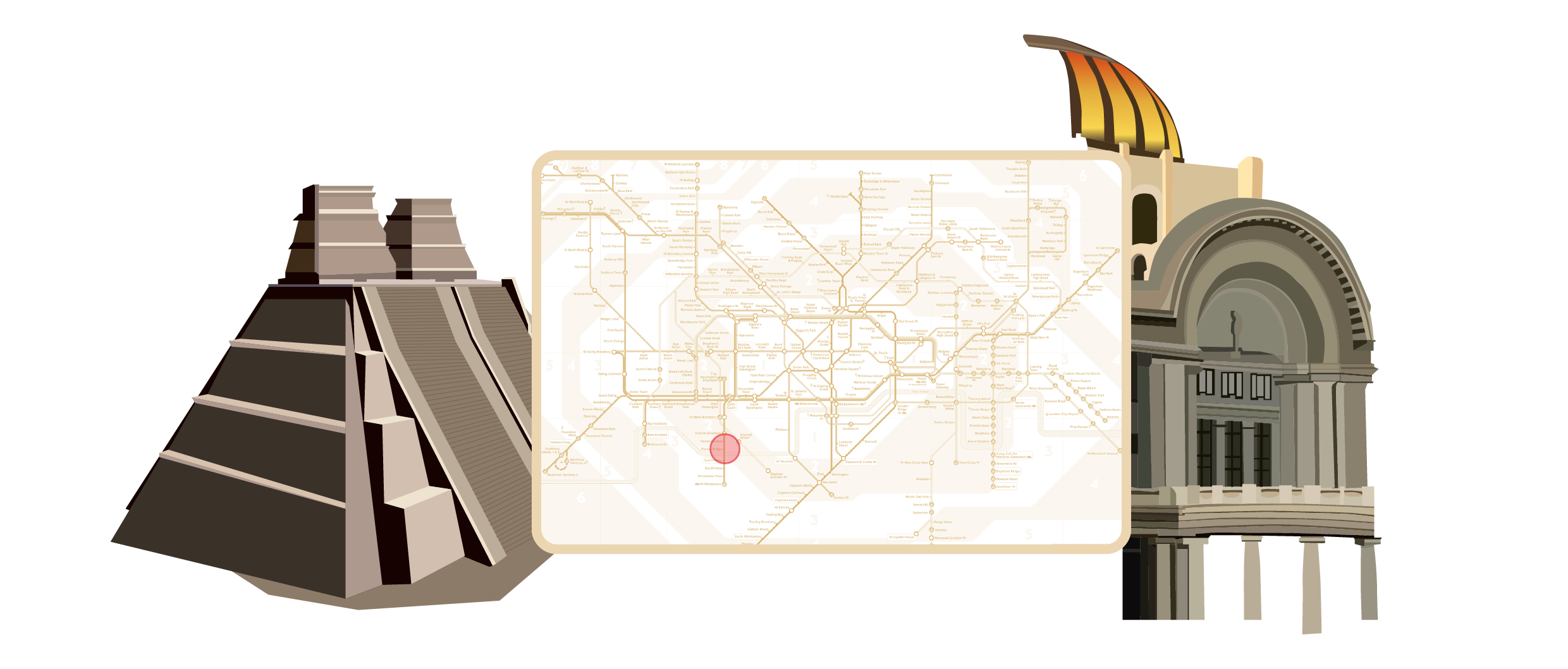
The sites are chosen based on research of the city, showing a place that connects and represents the community and culture from that specific showcased country. Site locations decisions can be either by historical events or by current immigration patterns and data. Bellow are some preliminary illustrations and an approximate idea of how the AR elements will appear while using the app.
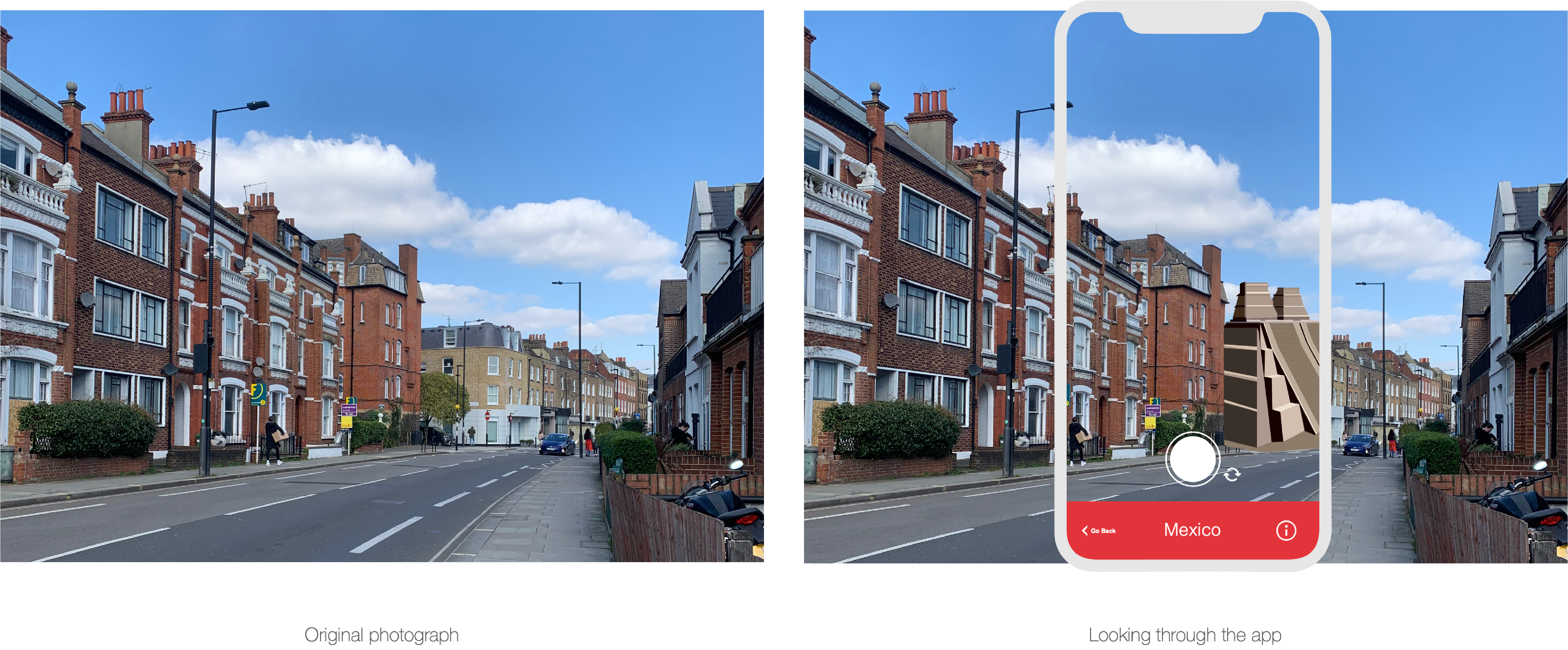
The design rationale for this project was based on Apple iOS Human Interface Guidelines, guaranteeing legibility and intuitive interaction.
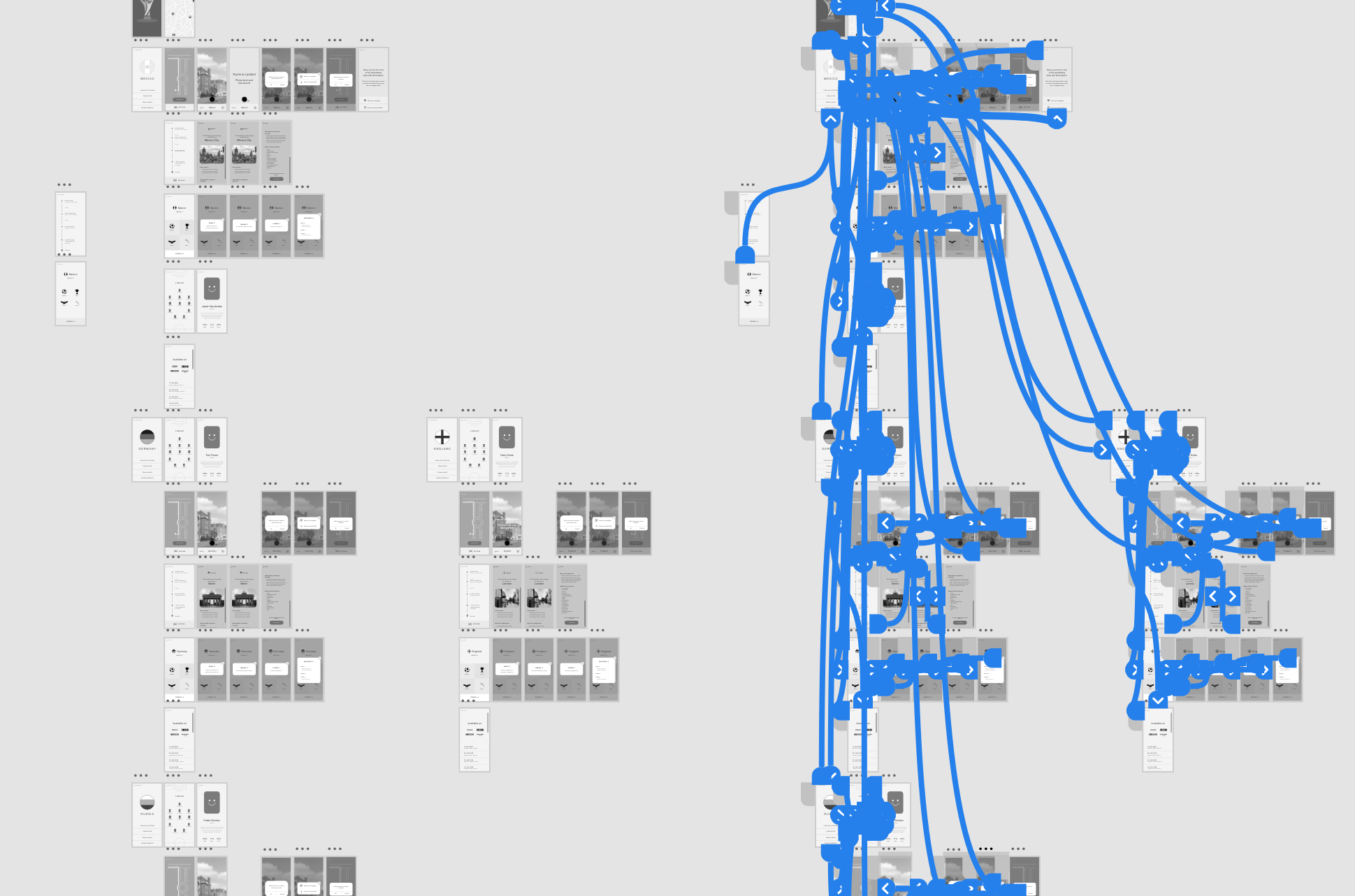
After analyzing the feedback received during the paper prototype testing, wireframes were designed to get a more intelligible idea of what the end product would look like. Also undergoing rounds of user testing, this step was crucial for adjustemts prior to the final prototype design. Below are some of the wireframe screens created using AdobeXD, along with blue guidelines showcasing what the interaction between screens would look like.
*Literary review, journey maps, storyboarding, and user testing were not showcased in this case study.
Intellectual property of Carolina De Alba
©2022